
Abstract:
Relating to or denoting art that does not attempt to represent external reality, but rather seeks to achieve its effect using shapes, colours, and textures.
"abstract pictures"
synonyms: non-representational, non-realistic, non-pictorial, symbolic, impressionistic
"abstract art"
Relating to or denoting art that does not attempt to represent external reality, but rather seeks to achieve its effect using shapes, colours, and textures.
"abstract pictures"
synonyms: non-representational, non-realistic, non-pictorial, symbolic, impressionistic
"abstract art"
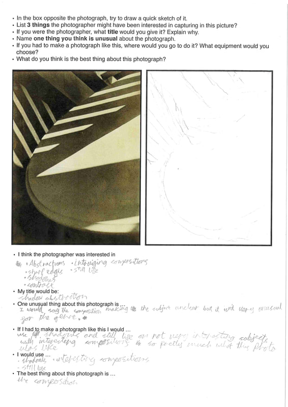
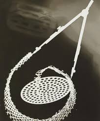
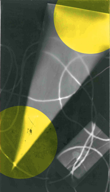
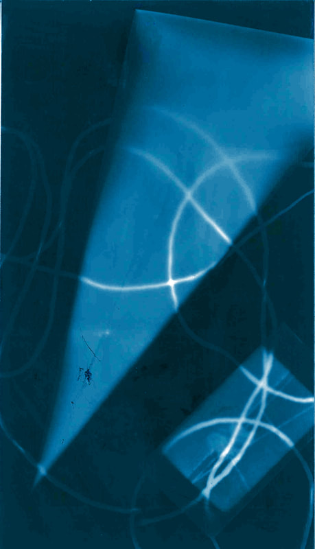
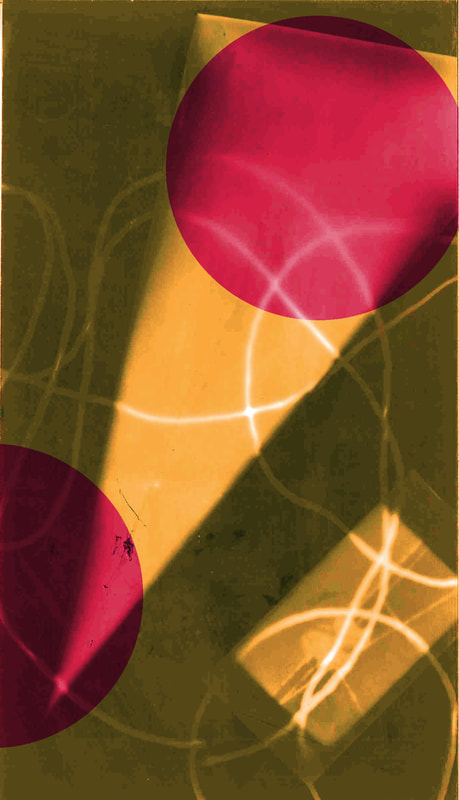
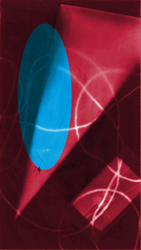
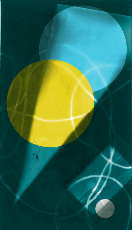
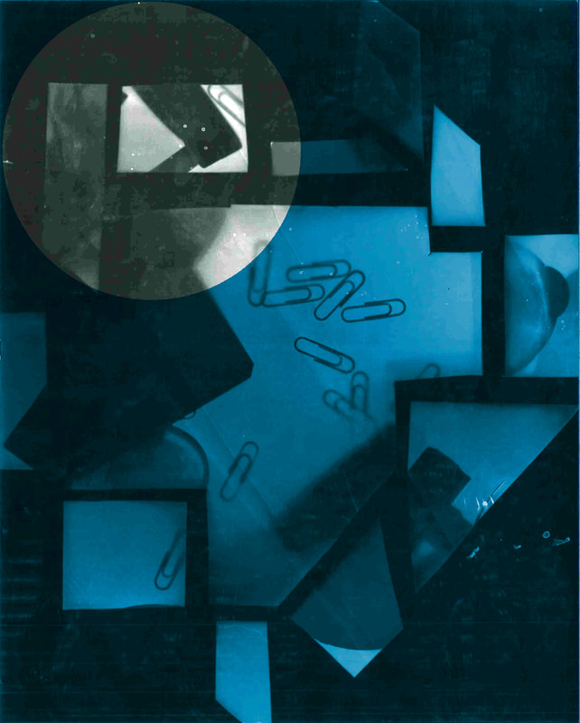
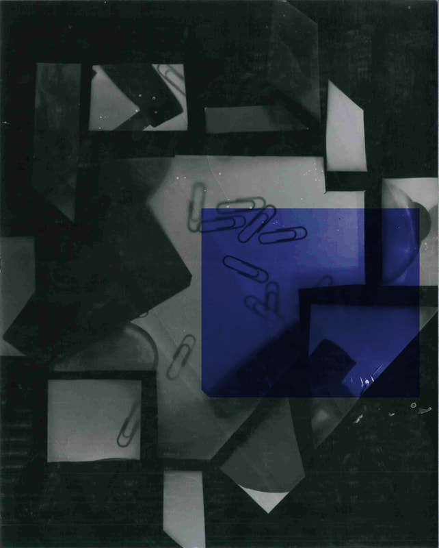
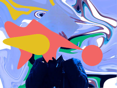
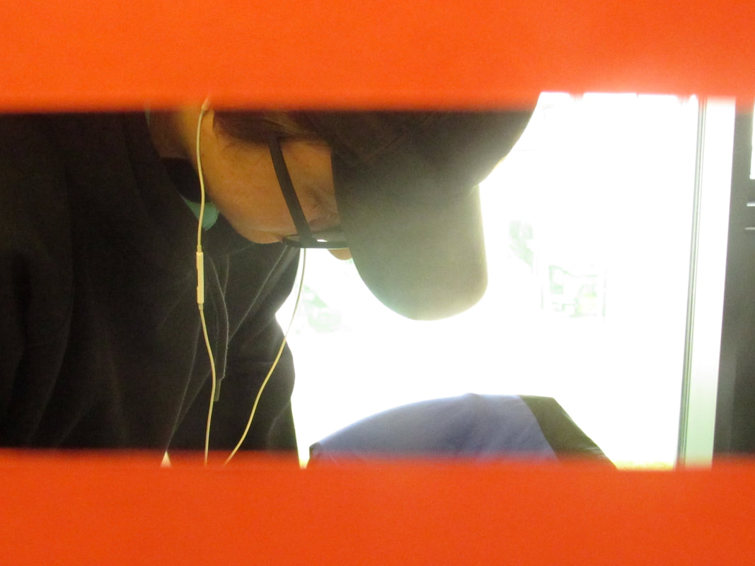
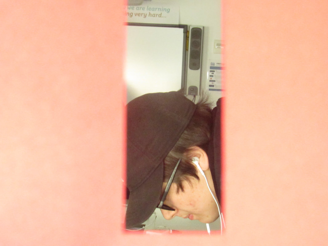
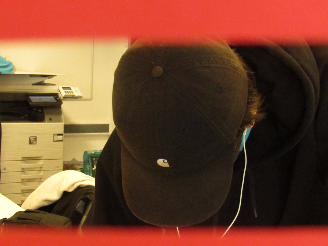
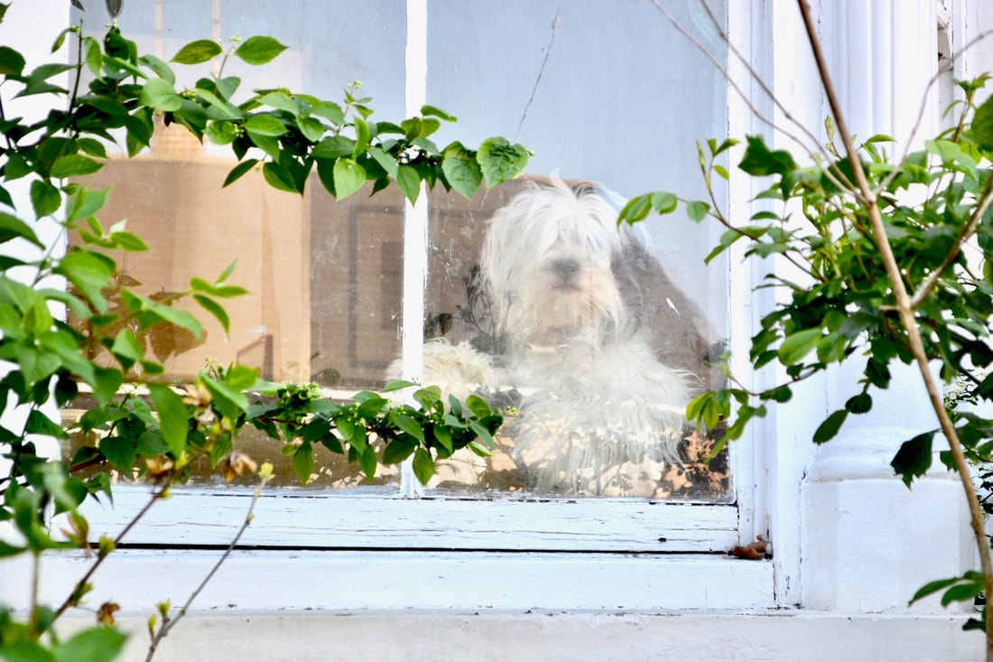
andThis is a worksheet I did on this abstract photograph the drawing came out really faint in the scan I don't know why.
Formal elements:
Composition: How the image is composed and constructed. It is where the objects of the image are.
Light: Light is what all images are made up of. Photography is the capturing of light
Tone: The range of the lightest and the darkest point in an image
Colour: The property possessed by an object of producing different sensations on the eye as a result of the way it reflects or emits light.
Shape: The external form, contours, or outline of someone or something.
Focus: The state or quality of having or producing clear visual definition
Space: The area around the subject of the photograph
Texture: How the subject of the photograph looks like it would feel
Repetition: Objects shapes or lines that repeats itself
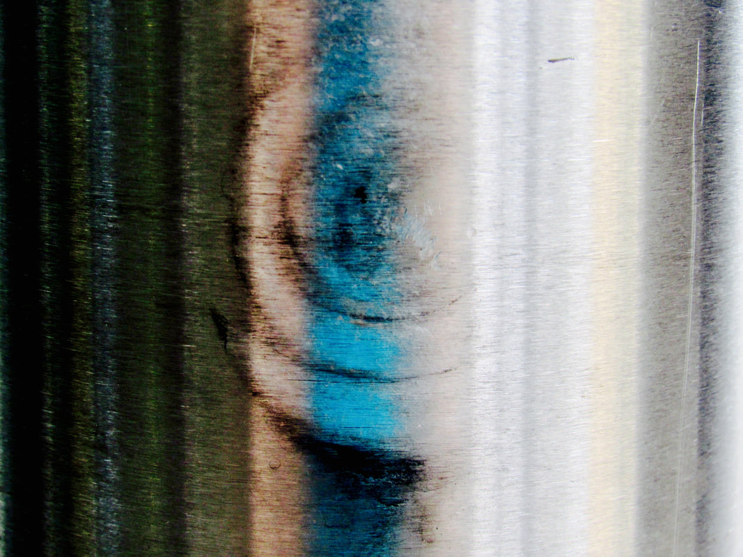
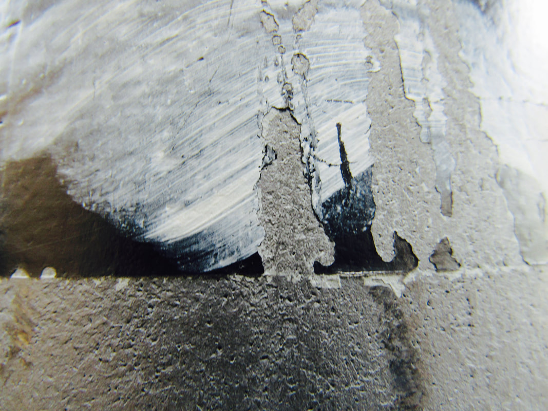
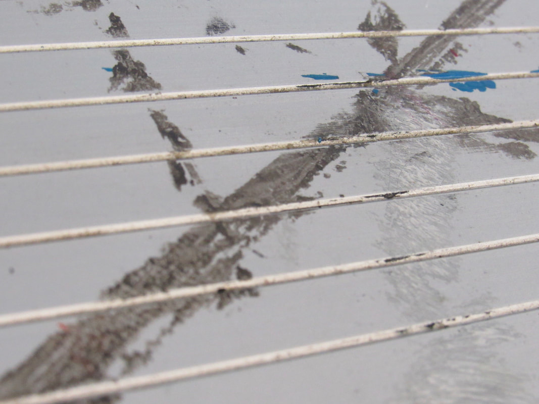

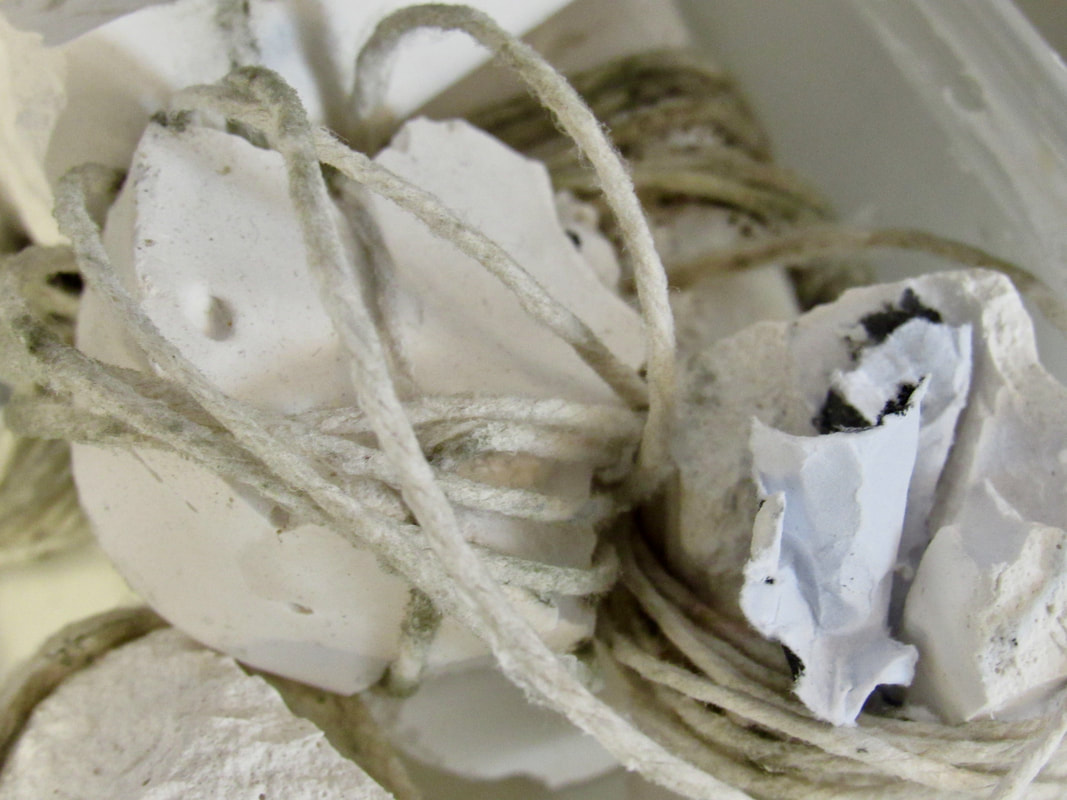
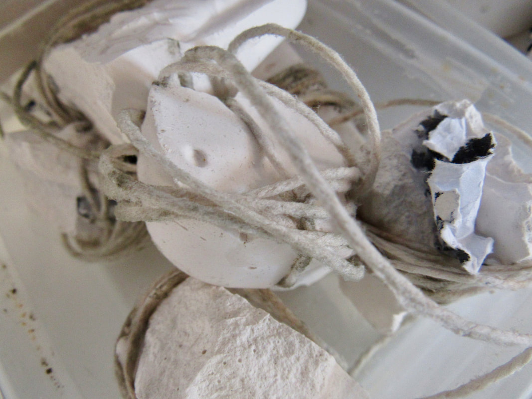
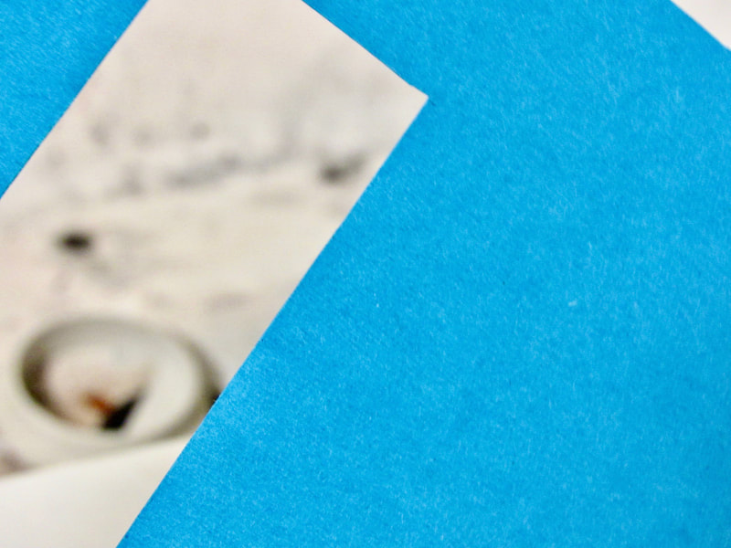
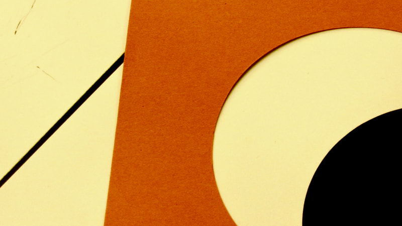
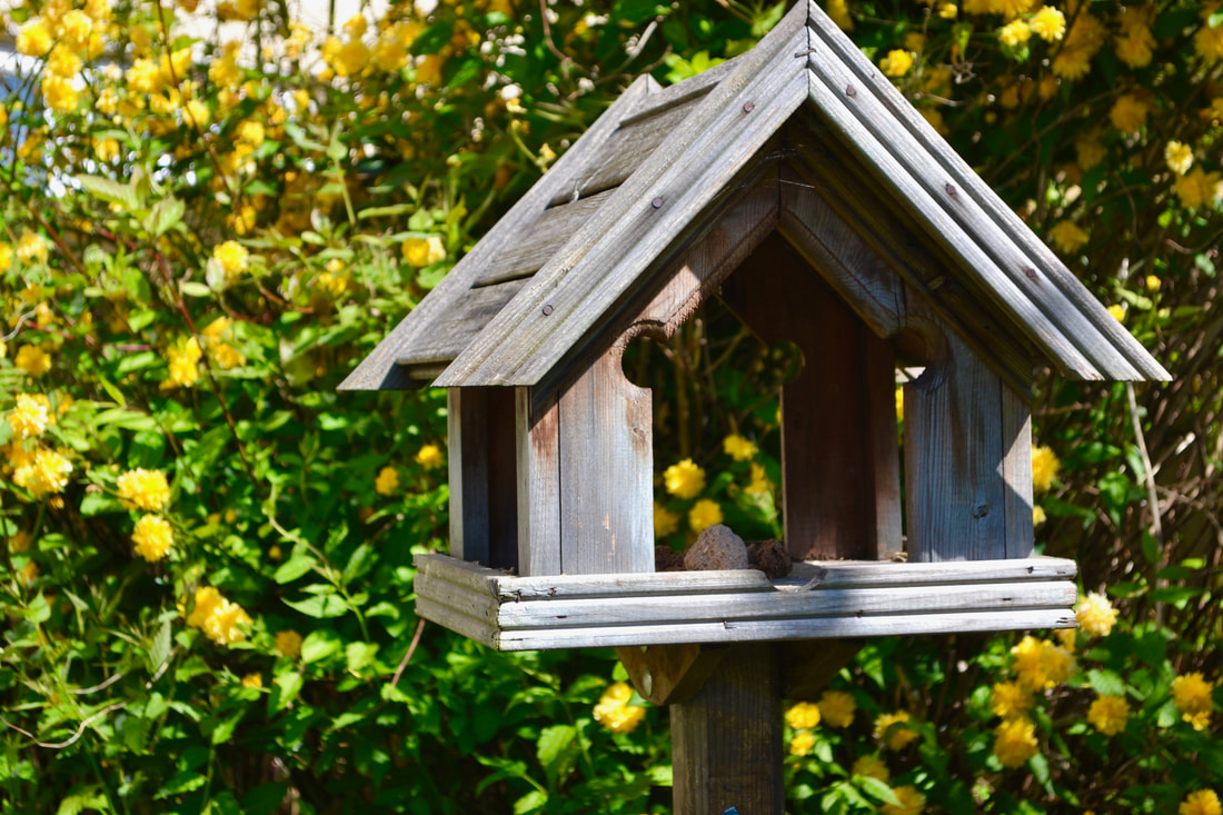
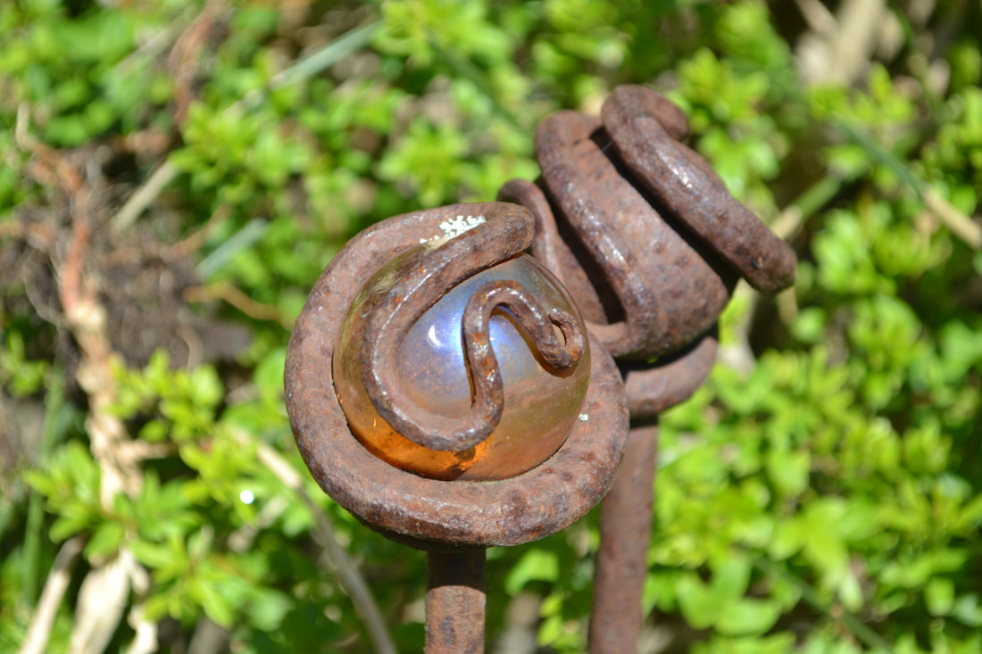
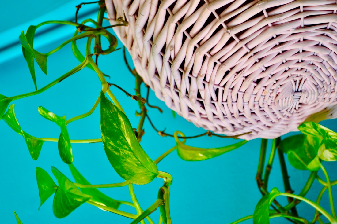
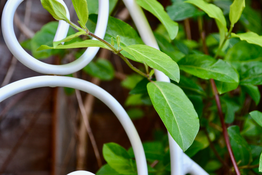
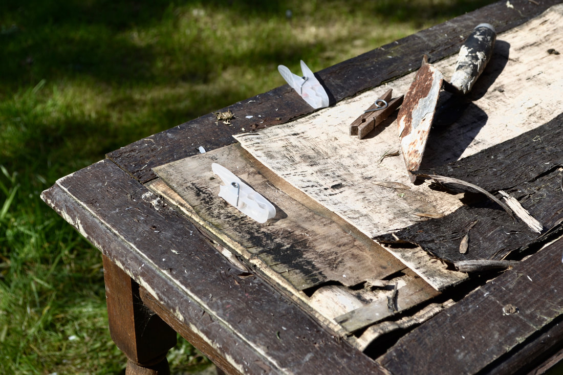
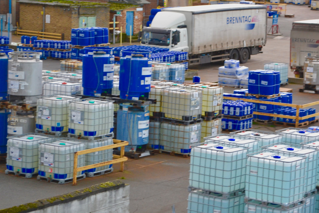
In this photo collection I focused on the formal element of composition. I think there were some interesting shots I especially like the one of the thing the door goes into when it opens all the way even though it is more focused on colour and I also like the ones of the dirt in the bottom of the sink. I think a lot of these shots are pretty mediocre and I think the framing is quite bad for some which is especially important as this was focusing on composition, I also think it lacks in abstraction which is one of the other focuses, another thing is that I think the colours in them are quite dull and not in a nice muted way just in a bland boring way so I think theres a lot of room for improvement which I hope I will improve on next time.
Abstract photograms
Photograms that are relating to or denoting art that does not attempt to represent external reality, but rather seeks to achieve its effect using shapes, colours, and textures. Some photogram artists include László Moholy-Nagy and Man Ray. Which you can see on my Photograms page, you will also find descriptions of how they are made and also some of my own photogams.
These are some photograms I like by György Kepes
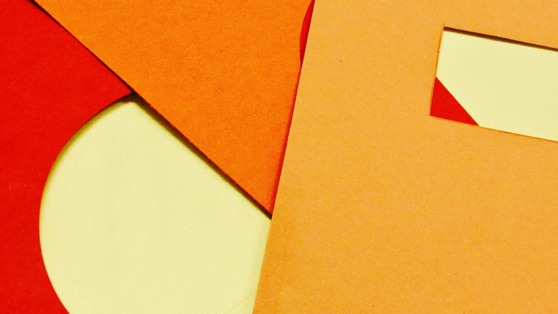
3d tallis abstraction:
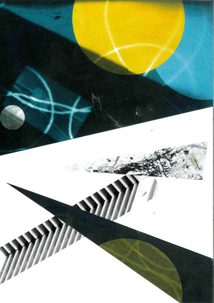
I think the idea behind this piece is the idea of contrast it focuses on the contrast of the colours with the help of photoshop the artist has implemented surreal and abstract colours into an overall complex and pleasing colour scheme, it also seems as if it focuses on the contrast of perspective as it has a surreal composition, how the piece is cut and bent to make it 3d reinforces this.
It also has a clear left, right and centre part to it which is reinforced by both the colours sticking to each part and how it is bent, probably the most prominent feature of this artwork is the purple sky, I really like the dark but warm way that this represents and I really think that it ties the whole piece together. I also like where it is bent, because of it following the lines in the photograph I think it makes it seem really natural and it creates really nice shapes in the card. Overall I really like this and I think I might implement the 3d in some of my own work, I'd also like to use strange colour schemes in my work.
Nature circle abstraction:
Like the other piece this one creates an interesting frame, this time not in a 3d piece of card but on five different circles, the composition of the circles is 4 big ones surrounding 1 small one in the centre which I think looks really nice. In the circles the pictures have an overall theme of water and reflections in the water. I think that the colour scheme is really nice I think the artist has used a filter or has edited the colour in photoshop or something because it looks really warm and appealing, the centre circle doesn't appear to have any filter but it is the simplest and is only rippling water and it has no reflections or things in the water like the other ones and I think that is really nice it seems like it connects all of the images as if that image is the theme of the others. Overall I really like this piece and I'd like to use abstract frames and edited colour in my own work.
Like the other piece this one creates an interesting frame, this time not in a 3d piece of card but on five different circles, the composition of the circles is 4 big ones surrounding 1 small one in the centre which I think looks really nice. In the circles the pictures have an overall theme of water and reflections in the water. I think that the colour scheme is really nice I think the artist has used a filter or has edited the colour in photoshop or something because it looks really warm and appealing, the centre circle doesn't appear to have any filter but it is the simplest and is only rippling water and it has no reflections or things in the water like the other ones and I think that is really nice it seems like it connects all of the images as if that image is the theme of the others. Overall I really like this piece and I'd like to use abstract frames and edited colour in my own work.
Research:
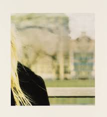
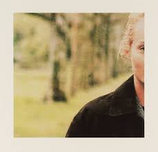
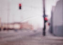
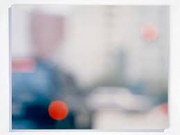
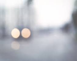
Uta Barth:
Uta Barth has a very unique photography style, most of the time she intentionally takes photos out of focus, I think she does this to draw the viewer to the light and the colour instead of the fine details, most of her photographs are someone mostly out of frame but very clear and then the blurry background is the rest of the frame. I really like this style.
Photograms
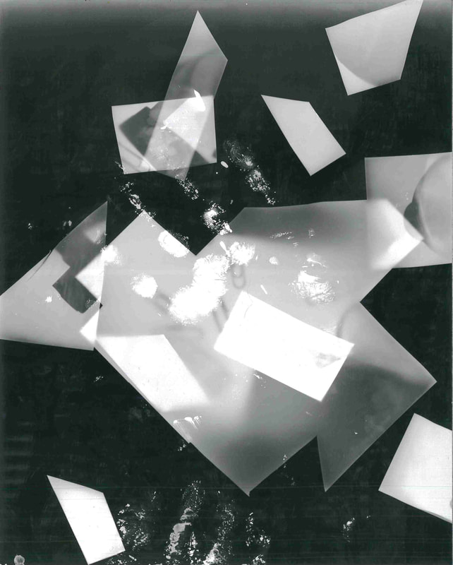
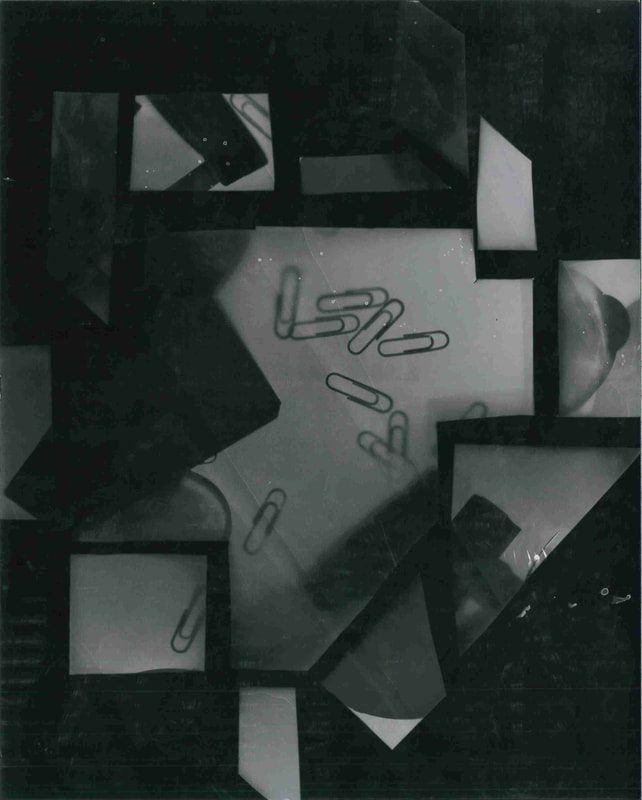
I think that these photograms are ok but they didn't come out quite as I expected them to. However I think that all of the imperfections make them better and I think that I can do a lot of experimentation with them through photoshop
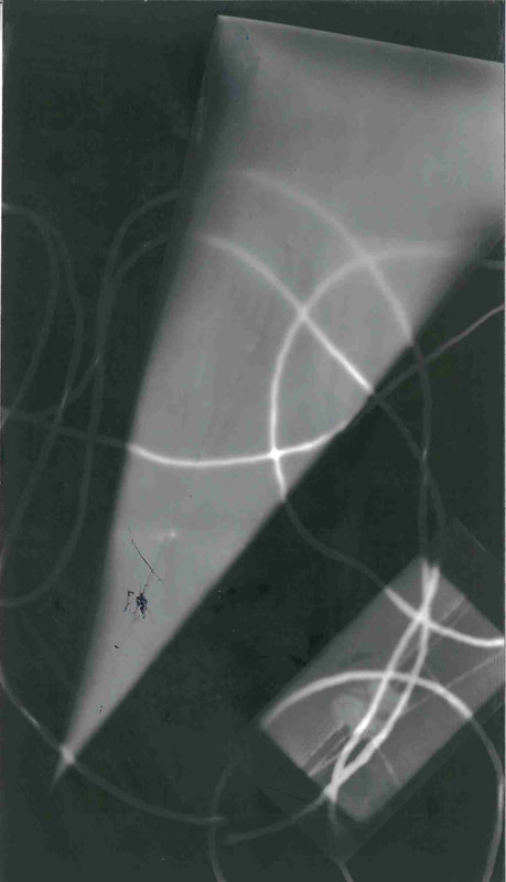
Here are some ideas for some duotone photograms
I think that these came out quite well, and i think that I have made improvements to the original unedited photograms, I also like this because I hadn't done anything like this before. I especially like the first set of photograms because of the variety of colours and unique aspect ratio.
Here is my collage made up of some of my previous photographs and a photograms. I focused on composition mostly so I made it quite simple but I think it came out quite well. I'd like to do something like this again in the future.
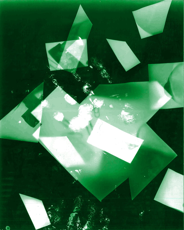
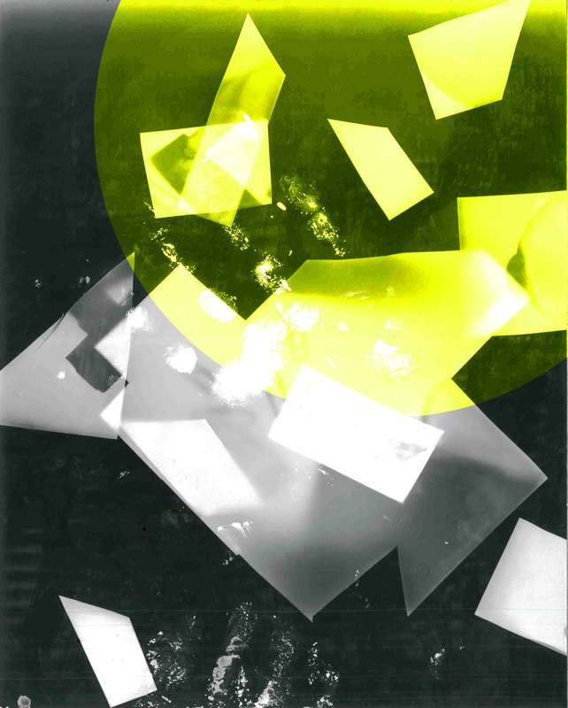
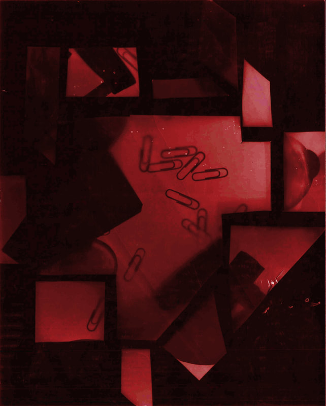
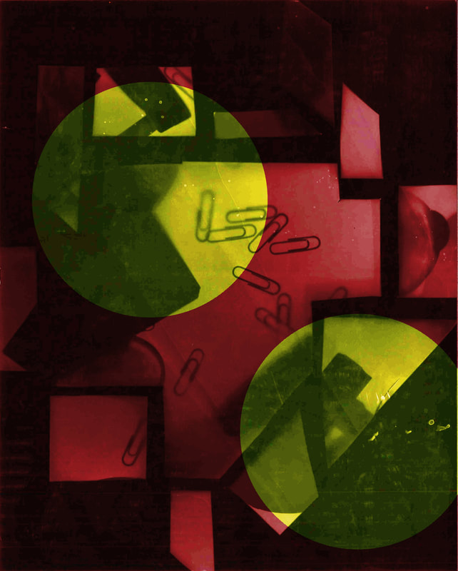
Here are some examples of photoshopped abstract images I've made, I don't think they came out amazingly but I think that they are alright for a first attempt. I'd like to do more stuff like the first one and more simplistic but I'd like to give more complicated abstract images another go as well.
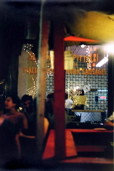
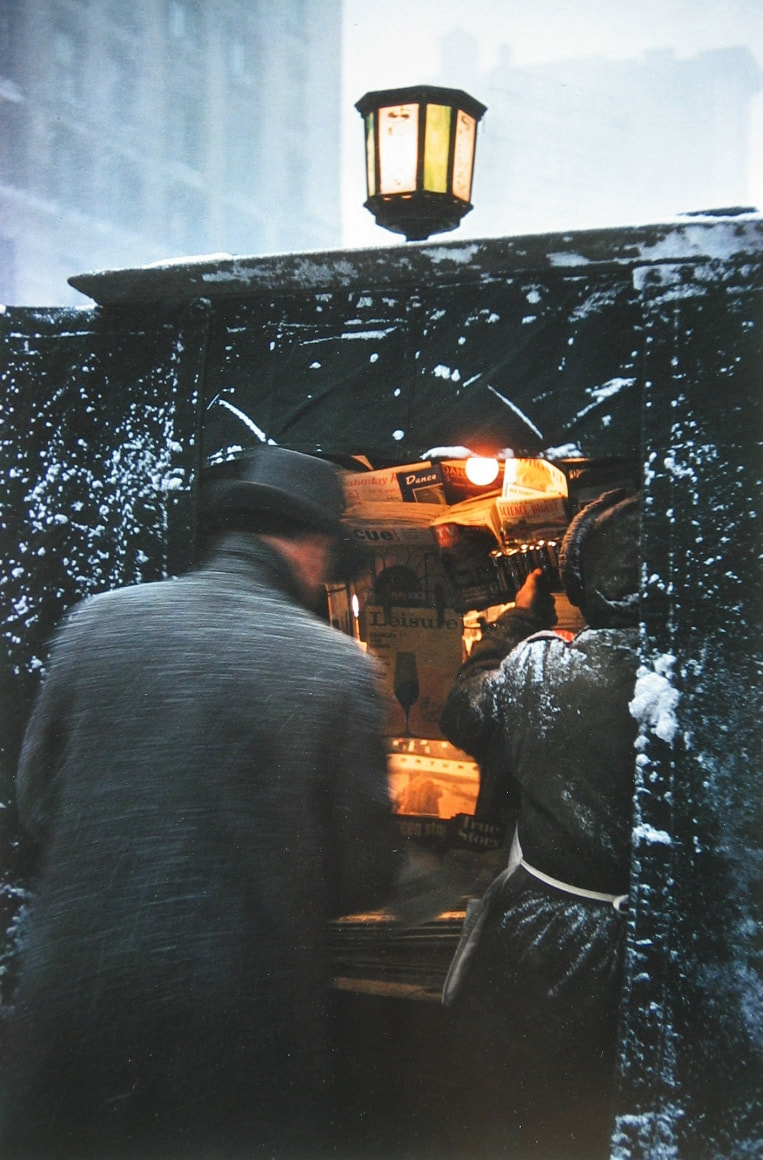
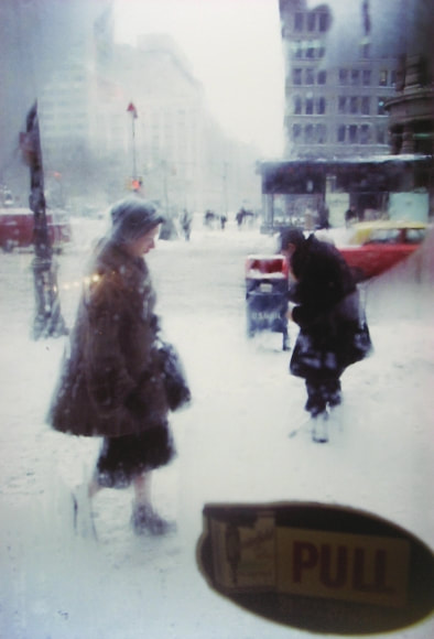
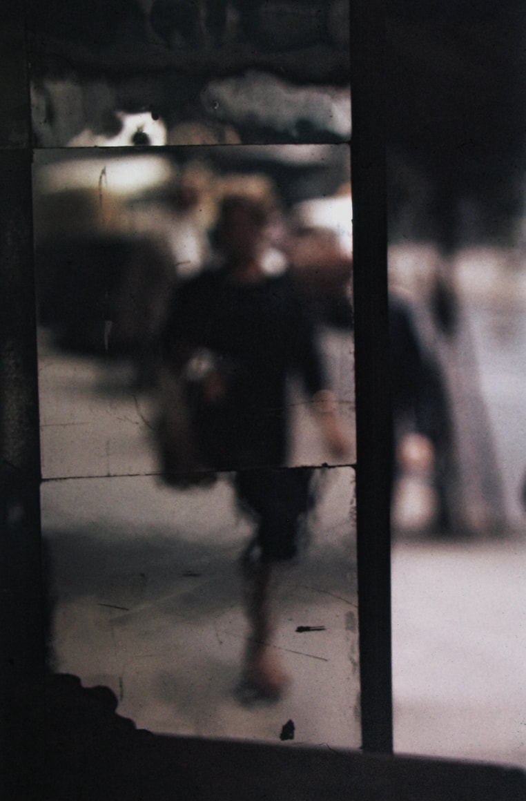
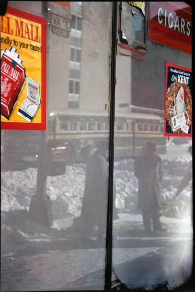
Saul Leiter:
5 key characteristics of Saul Leiter's photography:
1.) Creative compositions:
Saul Leiter using prominent lines of focus or the golden ratio splitting up the image into sections and contrasts it with negative space to create moods and make the image more aesthetically pleasing by constructing how the viewer looks at the photo even if there is nothing particularly exciting happening in it. This also can be seen as line from the formal elements.
2.) Strong colours:
Leiter uses specific colours to create warmth and coldness and in a lot of his photos there is a contrast between the two (contrast is also a key theme in his work). Saul Leiter also almost never uses exact colours, meaning that none of the colours are ever exactly a colour that can be named and when he does use these colours they are to draw attention to it going back to the first point of creative composition.
3.) Contrast:
Saul Leiter also uses contrast either between colour (regularly between warm and cold) or tone or even between used space and negative space. This is also shown in how he splits his images into parts, often having one of these things on one side and having the opposite on the other side which goes back to the original point about creative compositions.
4.) Movement:
Leiter also uses movement to create energy in his photographs and also another use of creative compositions and contrast with the blurry moving thing standing out and being the thing the view instantly looks at first.
5.) Foreground and Background:
He also uses a difference in depth between things in his photographs once again going back to creative compositions because it shows the viewer where they should be looking. This also ties into contrast because of the opposition between the two or more depths of the image are regularly contrasted.
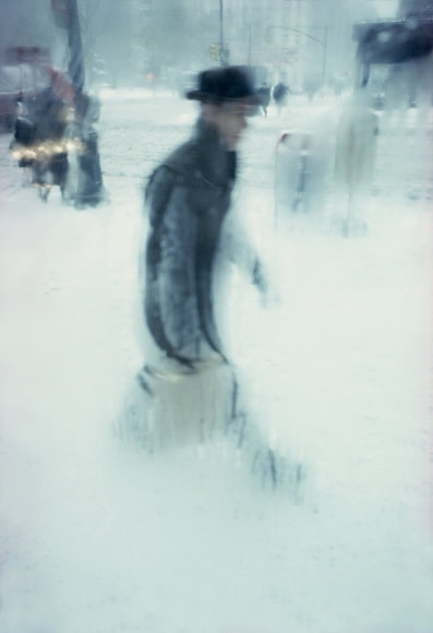
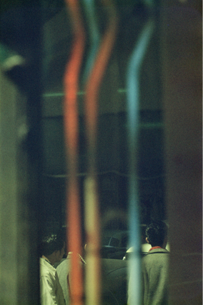
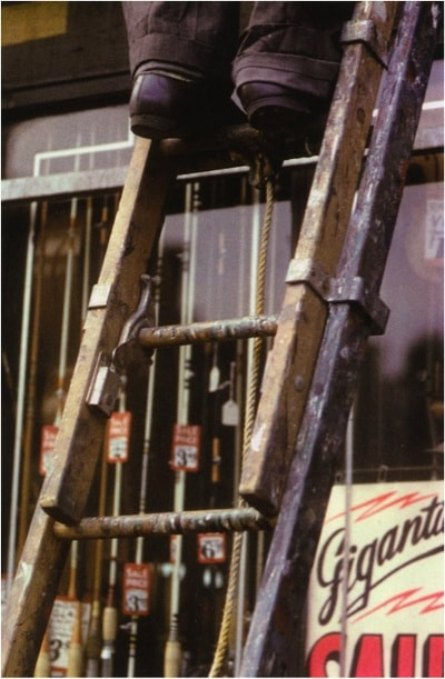
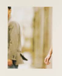
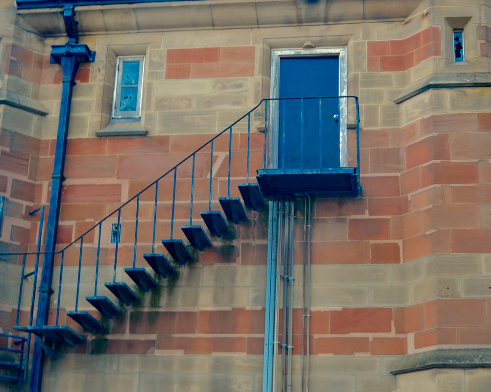
My Favourite Image:
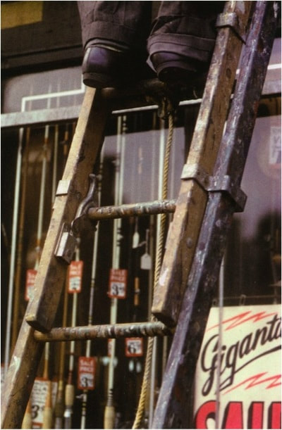
1.) Why did you chose this image in particular?
I chose this image because I really like the colours and also how it is framed and because of the prominent lines of the photo. Another thing I like about this photograph is the difference between the foreground and the background and how it is slightly grainy.
2.) What is surprising or unusual about this photograph?
Something that is slightly unusual about this photo is how simple but compact it is, an example of this being how the ladder goes exactly from the bottom left corner to the top left corner this makes the image seem very geometric and is quite different to other photographs by other photographers.
3.) Look carefully and choose one of the formal elements that you think is important to the photograph.
One of the formal elements that is important to this photograph is line, this is because the lines of the ladder are important as they dissect the photo into two halves and also with 4 other lines if you're looking at


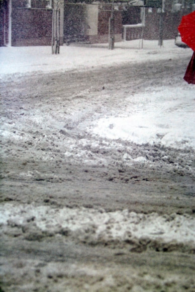
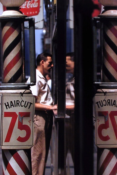
Here are some photos that I took when I was trying to take some photos that fit with Saul Leiter's style that didn't fit but I thought were ok as just generally photos anyway
Here are some photos that I've taken in the style of Saul Leiter, I think that they are okay but they could be better if I had more time and they are also all very similar but they are definitely better than the last ones .
Here are three of Saul Leiter's paintings, I chose these three because they are all on irregular canvases: a wooden plank, a broken canvas and a scrap of paper.
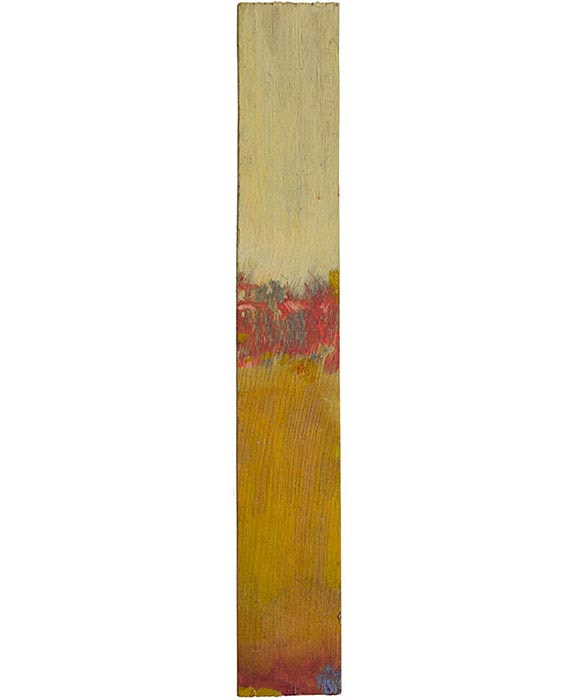
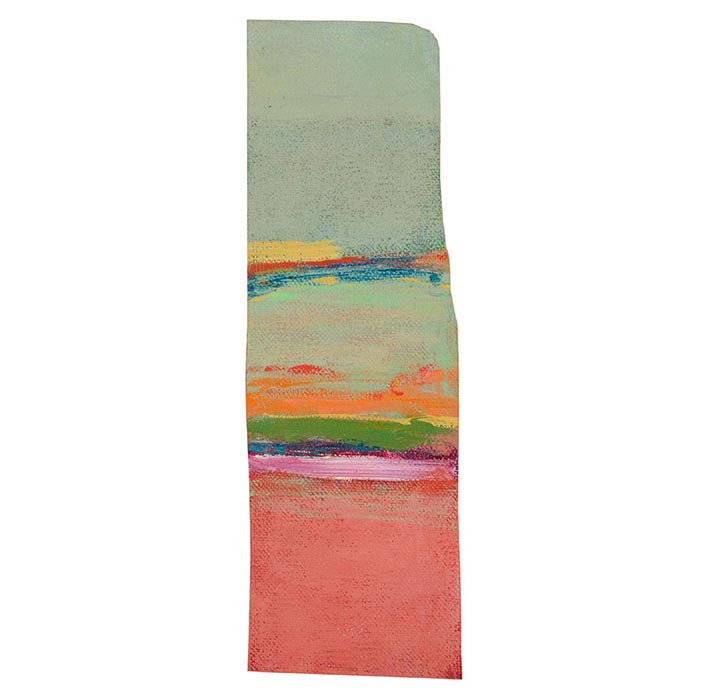
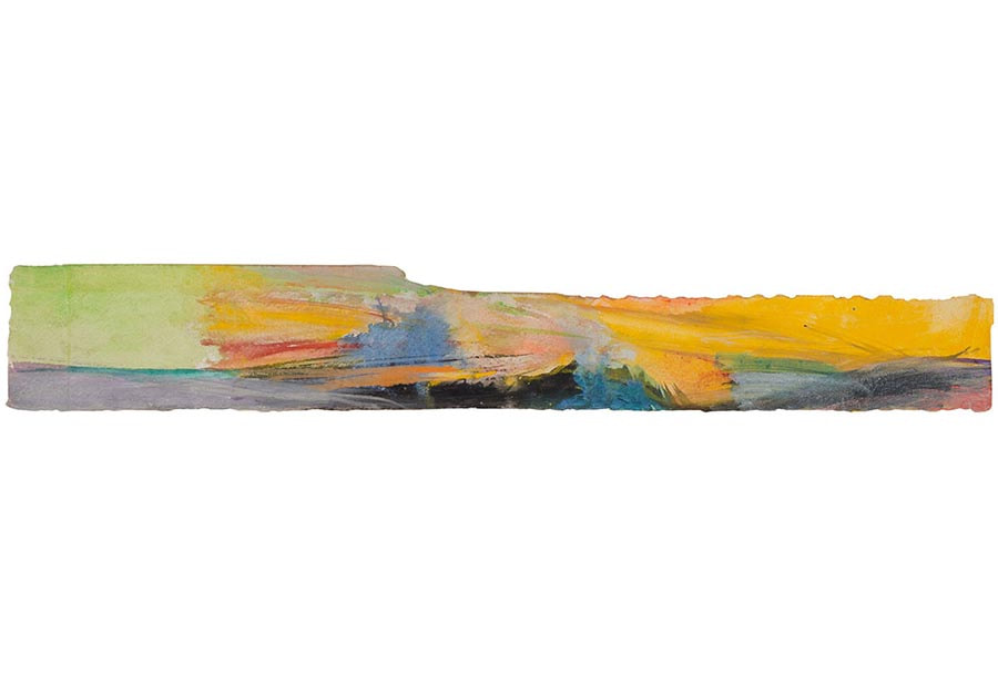
This painting is similar to Saul Leiter's photography because of the portrait image ratio and also because of the colours, these images also prominently feature the formal element of line and the main focus is in the centre and below.


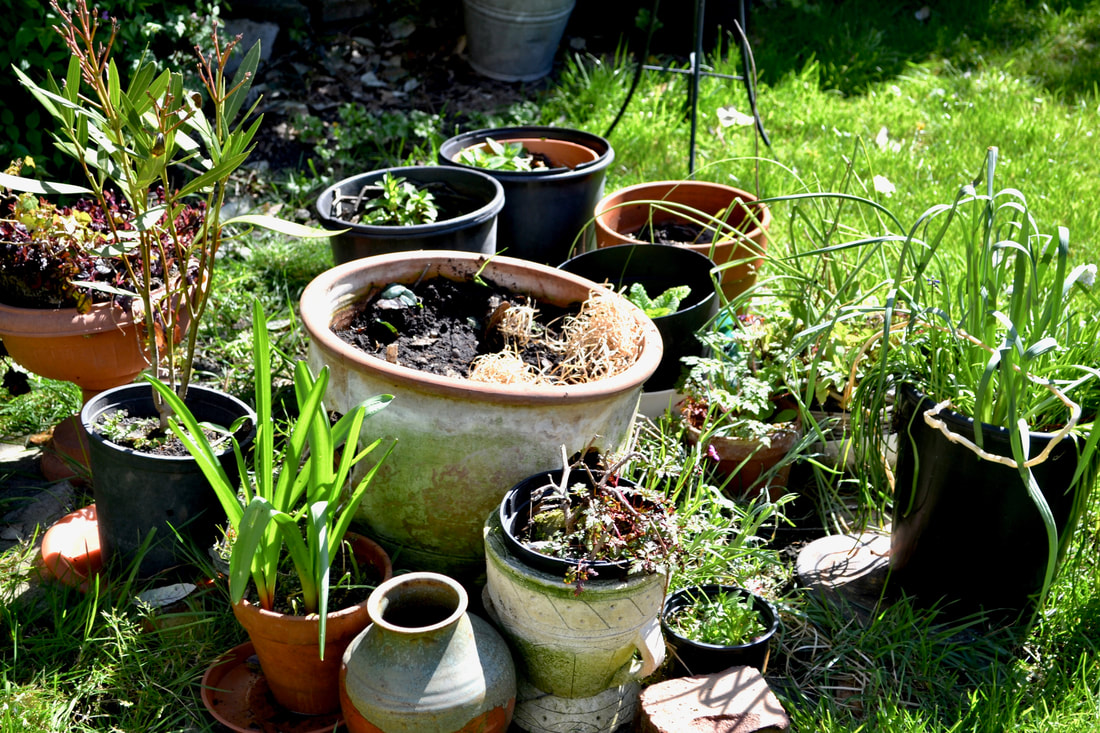
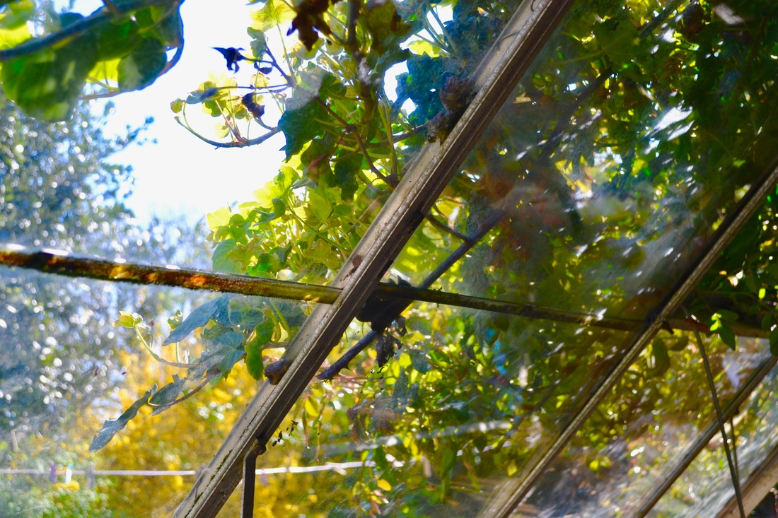

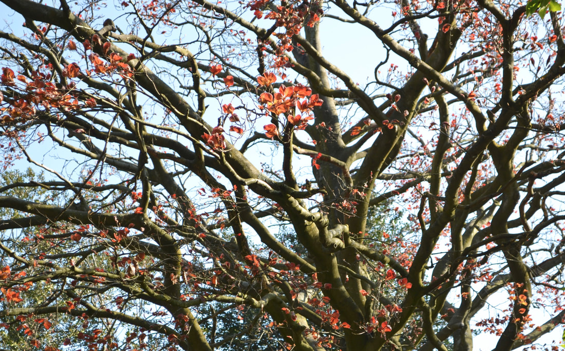
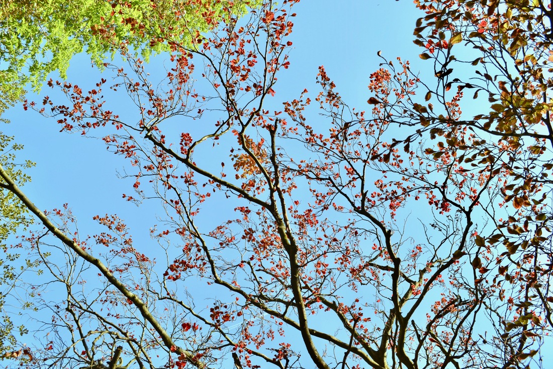
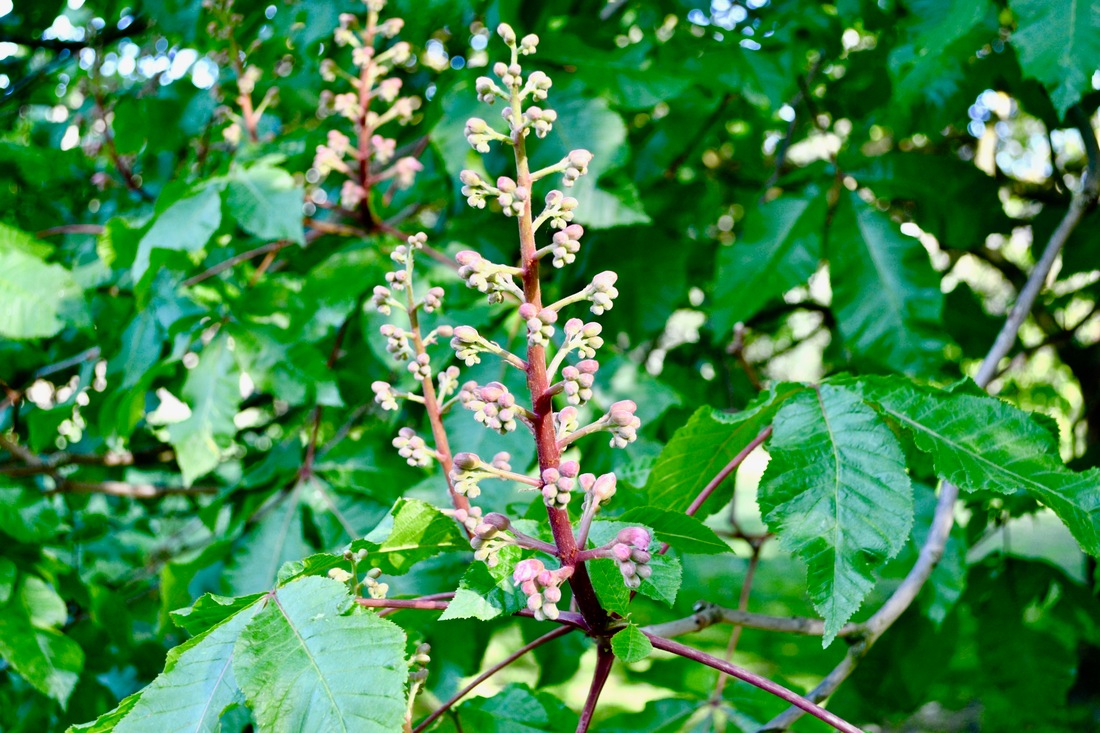
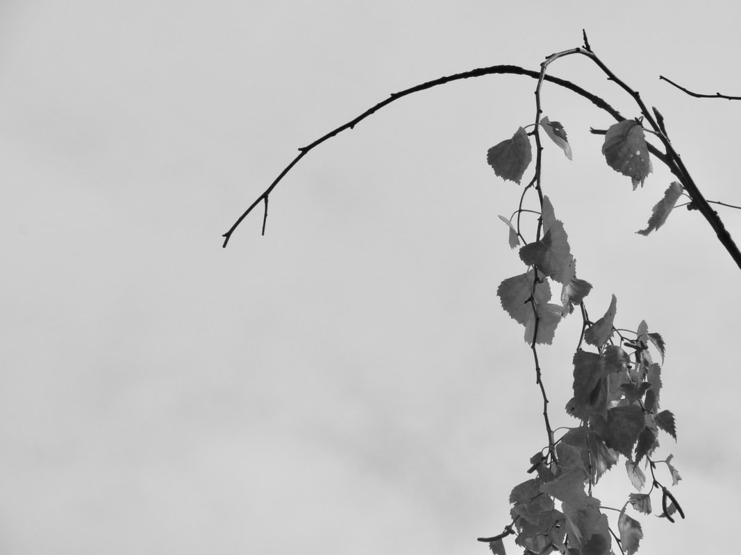
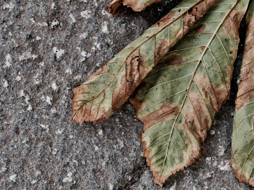
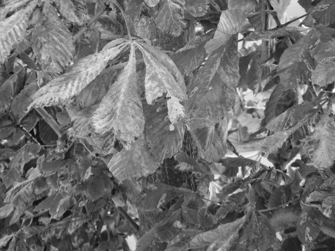
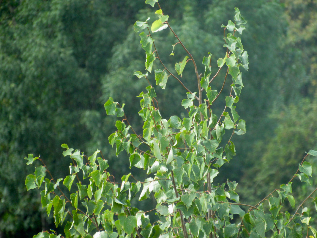
Here are some of the photos that I have taken over the Easter holidays, I think that they have come out quite nicely but like a lot of photos on this page they aren't very abstract and they definitely aren't like Saul Leiter's work.
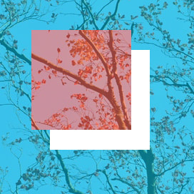
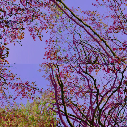

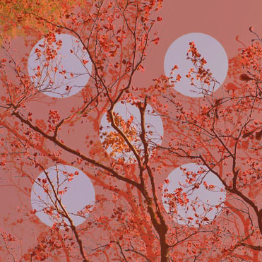
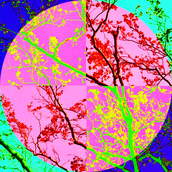
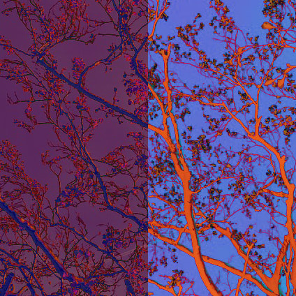
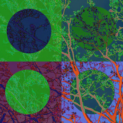
Here are my photos that I have edited, I took the idea of editing one photo in many ways and I used the photo of trees that I took over the easter holidays, I found that it's very difficult to edit it in many different ways and I don't like some of the later ones as I believe that I ran out of ideas however I like the idea of the set and to a certain extent I like the execution of the ideas.
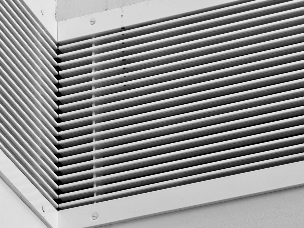
Homework photo set
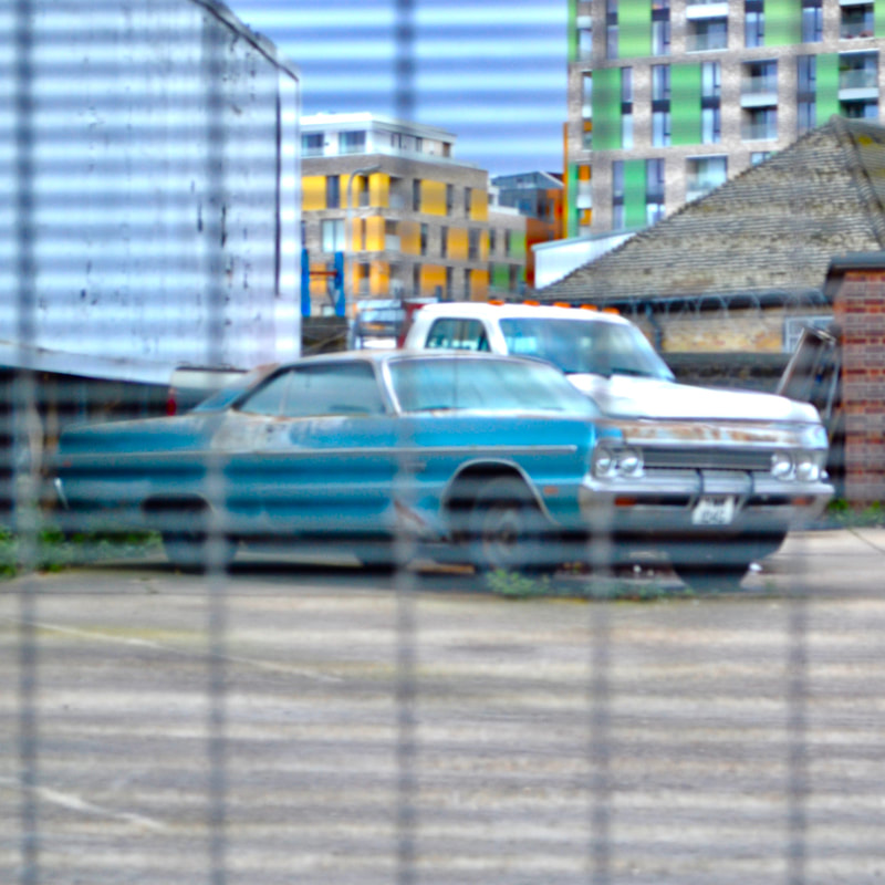
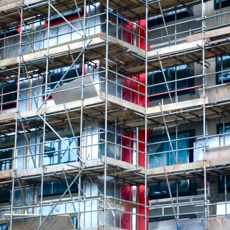
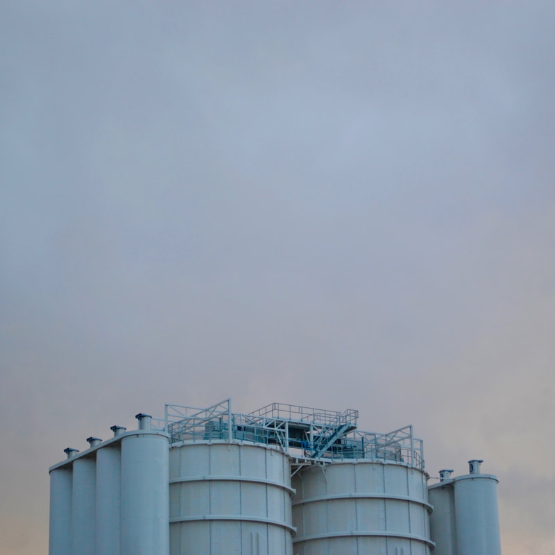

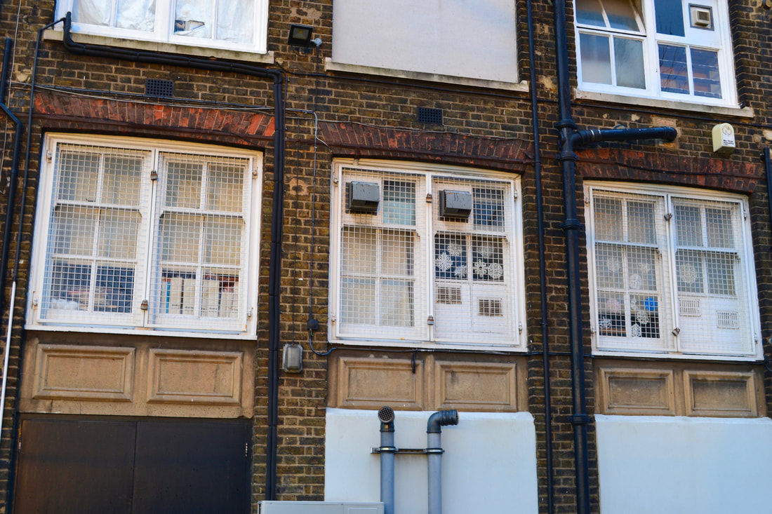
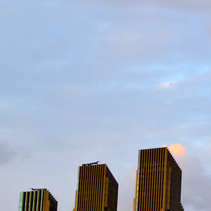
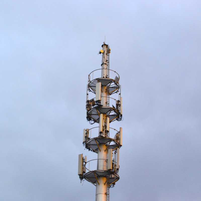
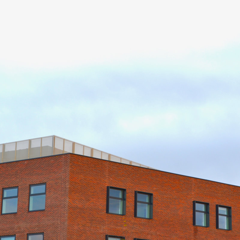
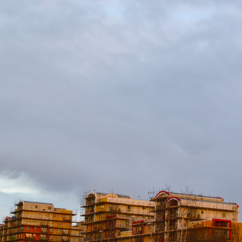
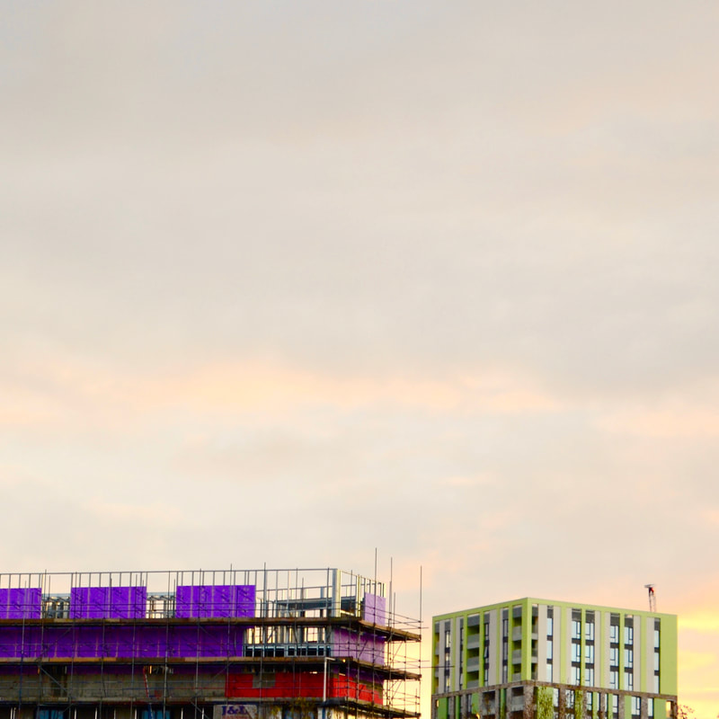
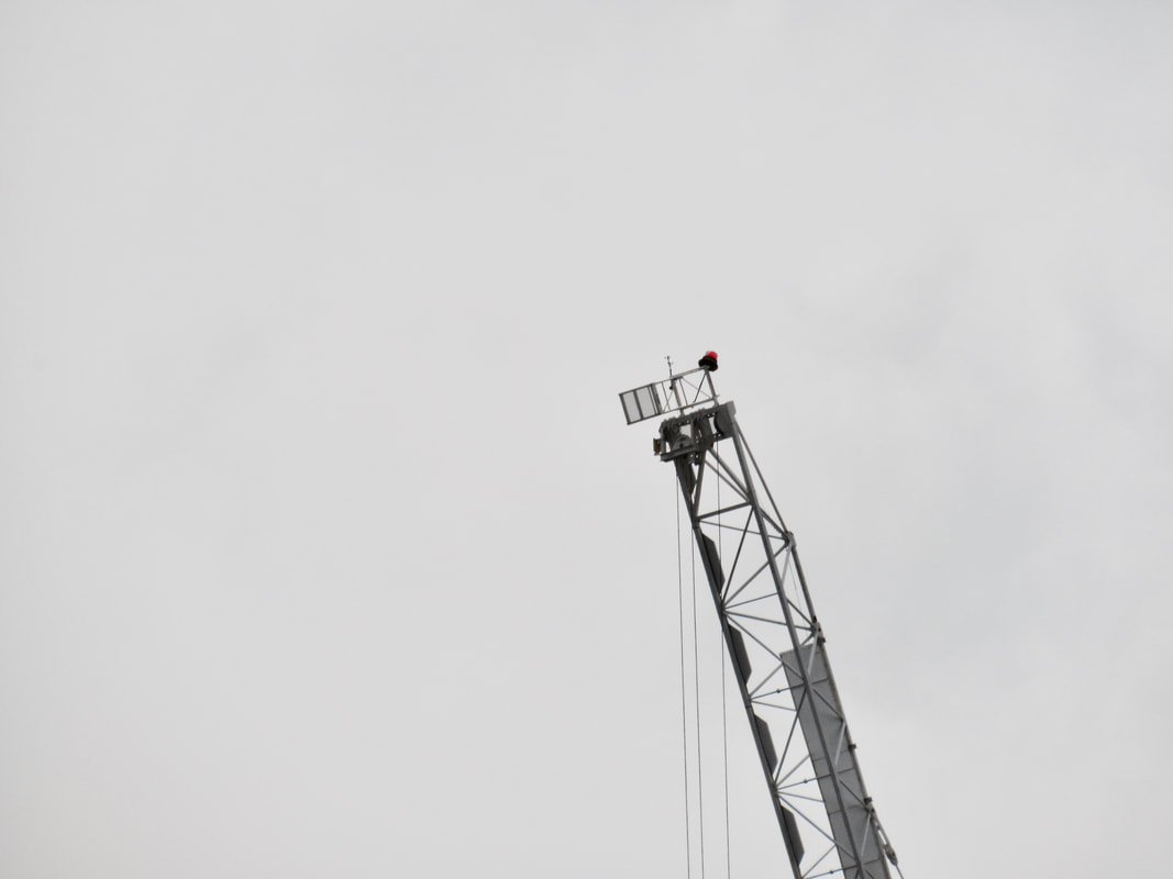
I took these abstract photos because I thought that I missed out on getting good photos for my homework when i picked unusual portraiture, these photos all have the theme of architecture, I think that these photos are generally quite good and I think that I have achieved what I was hoping to do. I used a fairly high saturation and square aspect ratio for these photos and I think that these common themes add to the photos and make them more abstract. I purposefully used unusual framing to make the photos more abstract.
