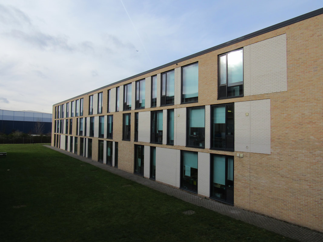


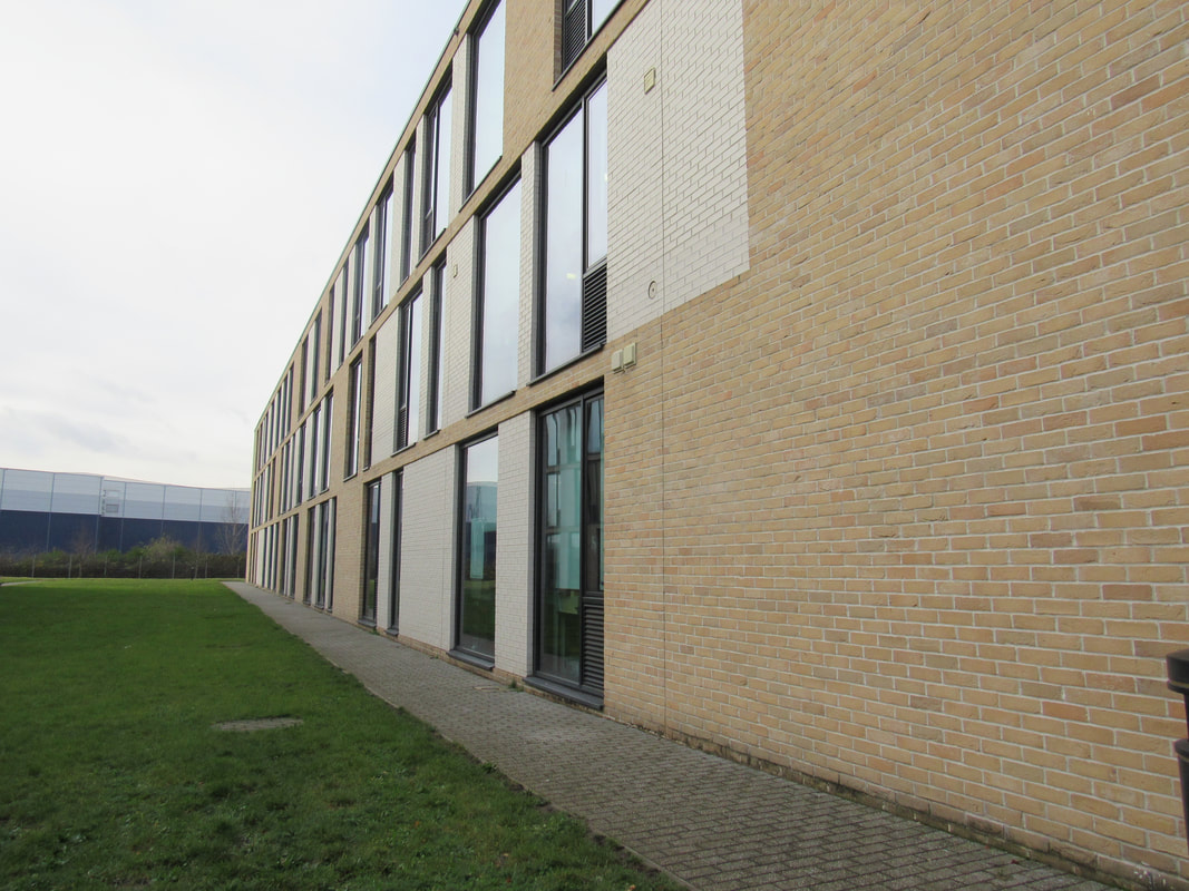
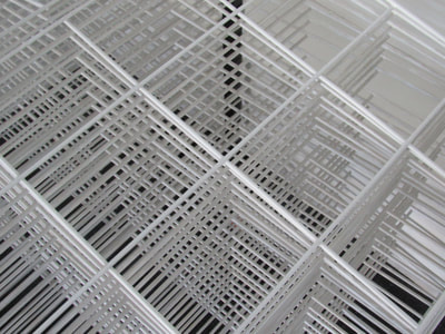
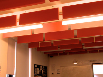
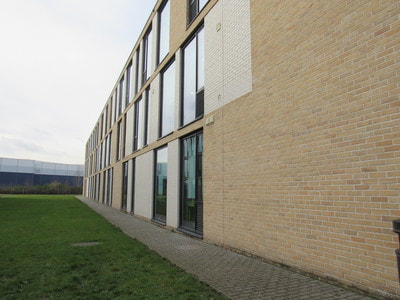
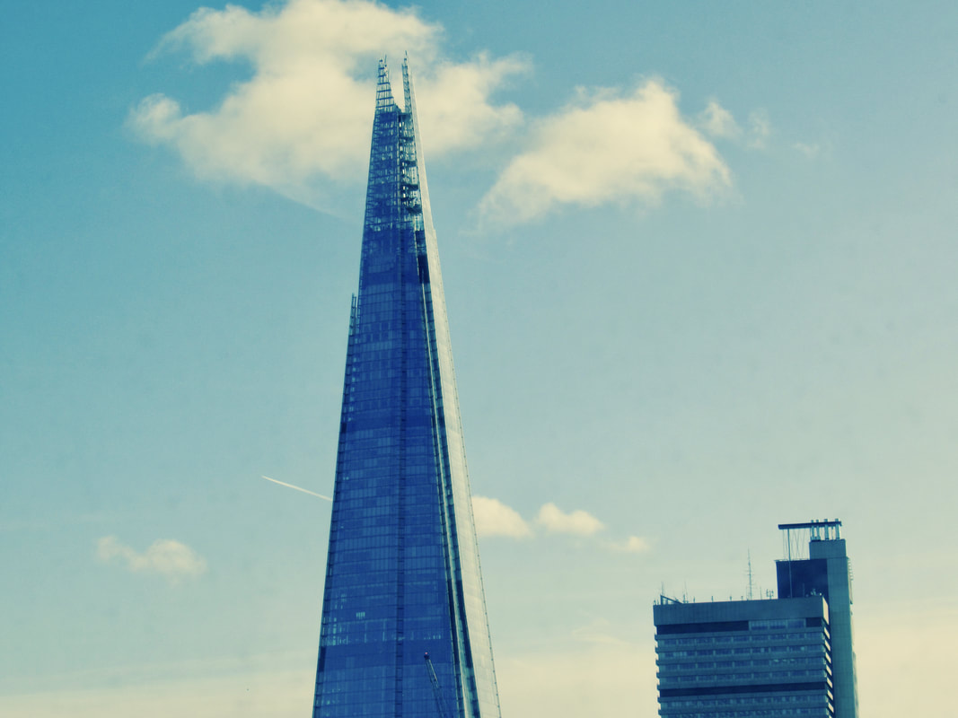
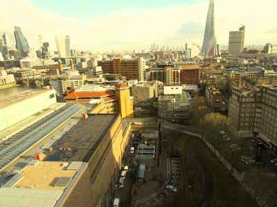
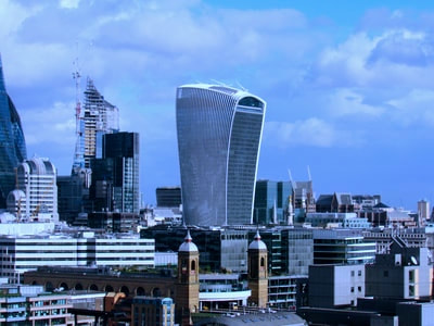
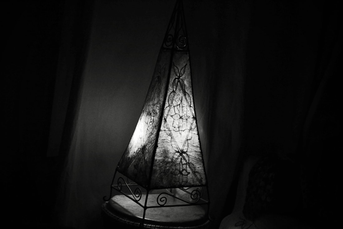
These are my photographs with the recurring theme of edges. Edges are important in photography when choosing a subject, a photographer must decide how they would like the edges of the subject to look like; straight or curved, sharp or smooth there are many things to take into account. I focused mainly on the angle of the subject and the camera, for example for the first one I used the angle of the building and my camera to make the building stretch out to the corners of the frame thus making the size of the building exaggerated.
This is my evaluation of my homework however I have not uploaded them to my website yet if you see this then I will upload them later today.
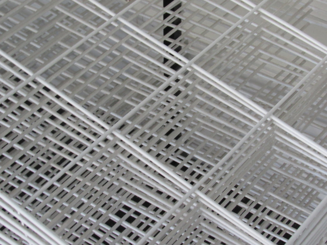
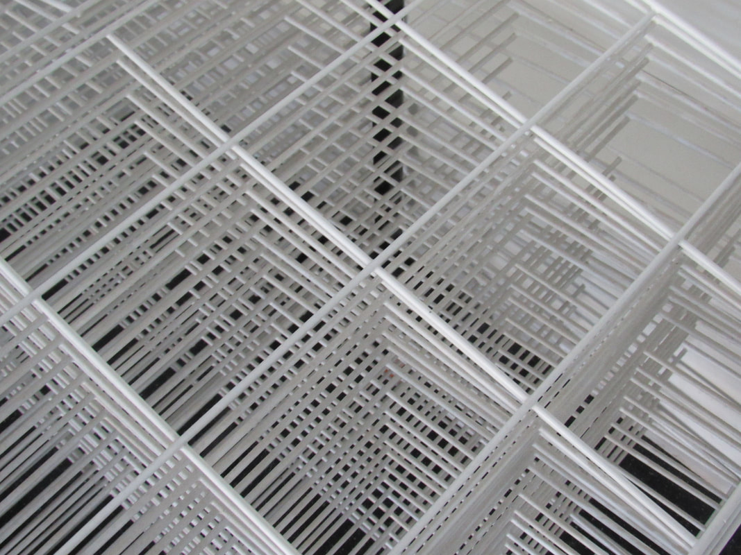
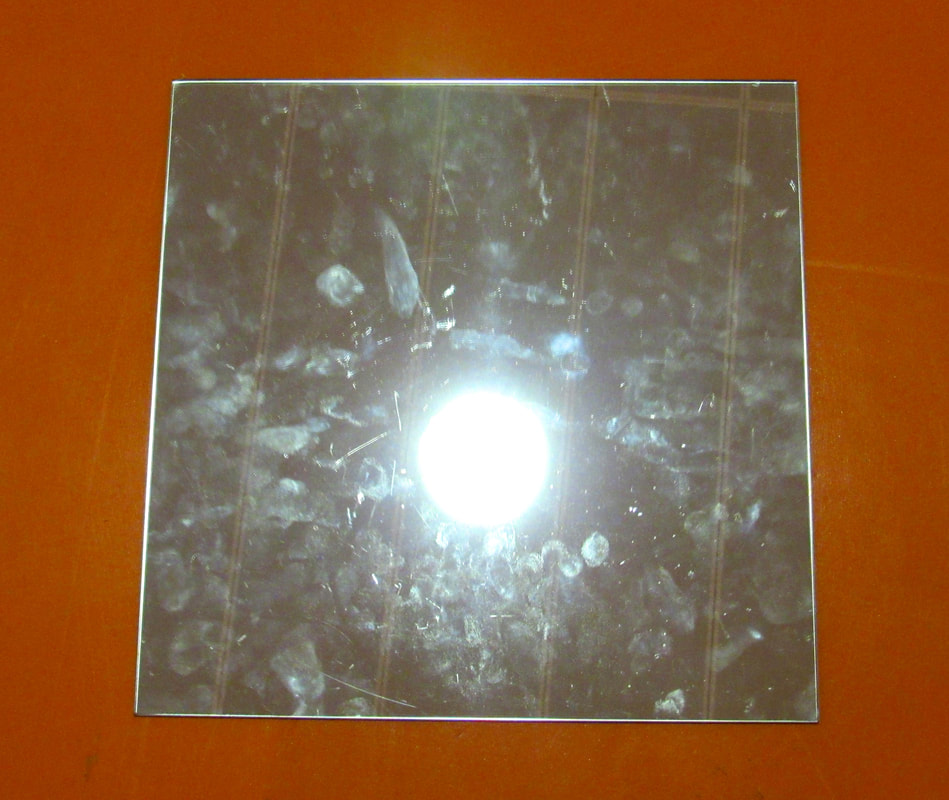
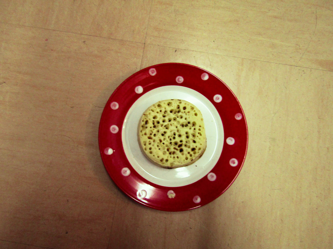
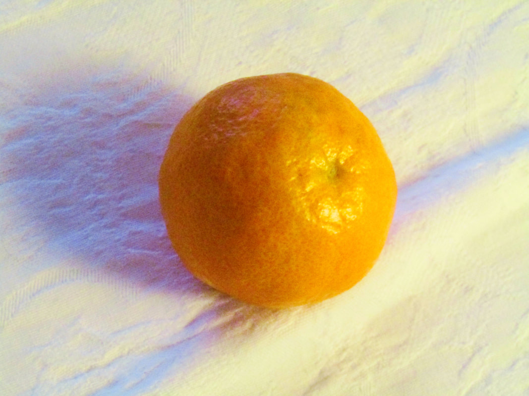
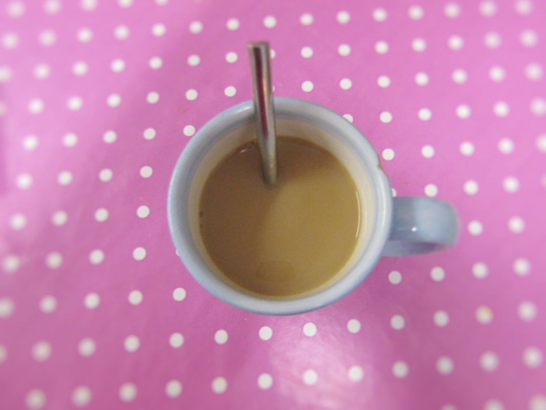
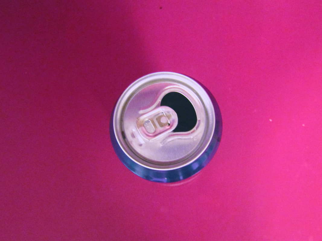
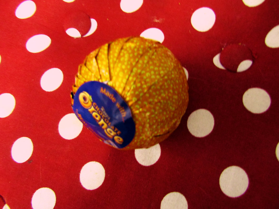
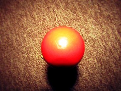
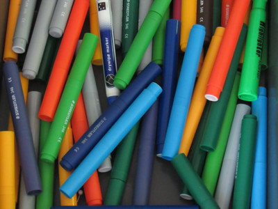
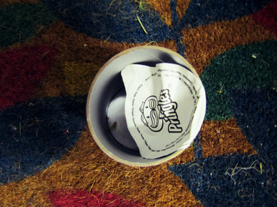
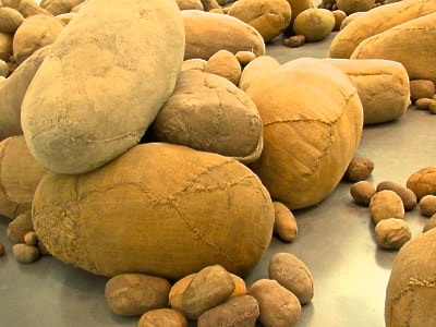
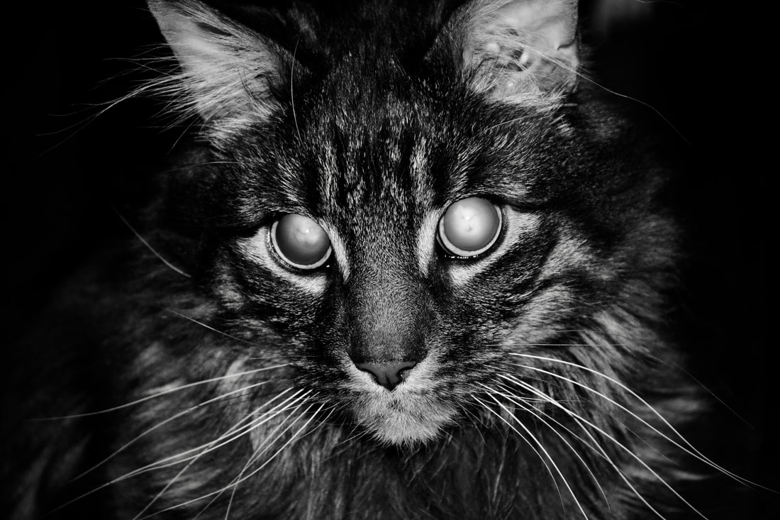
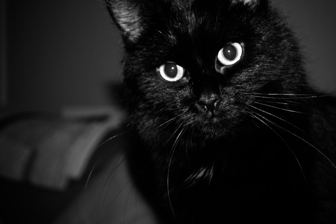
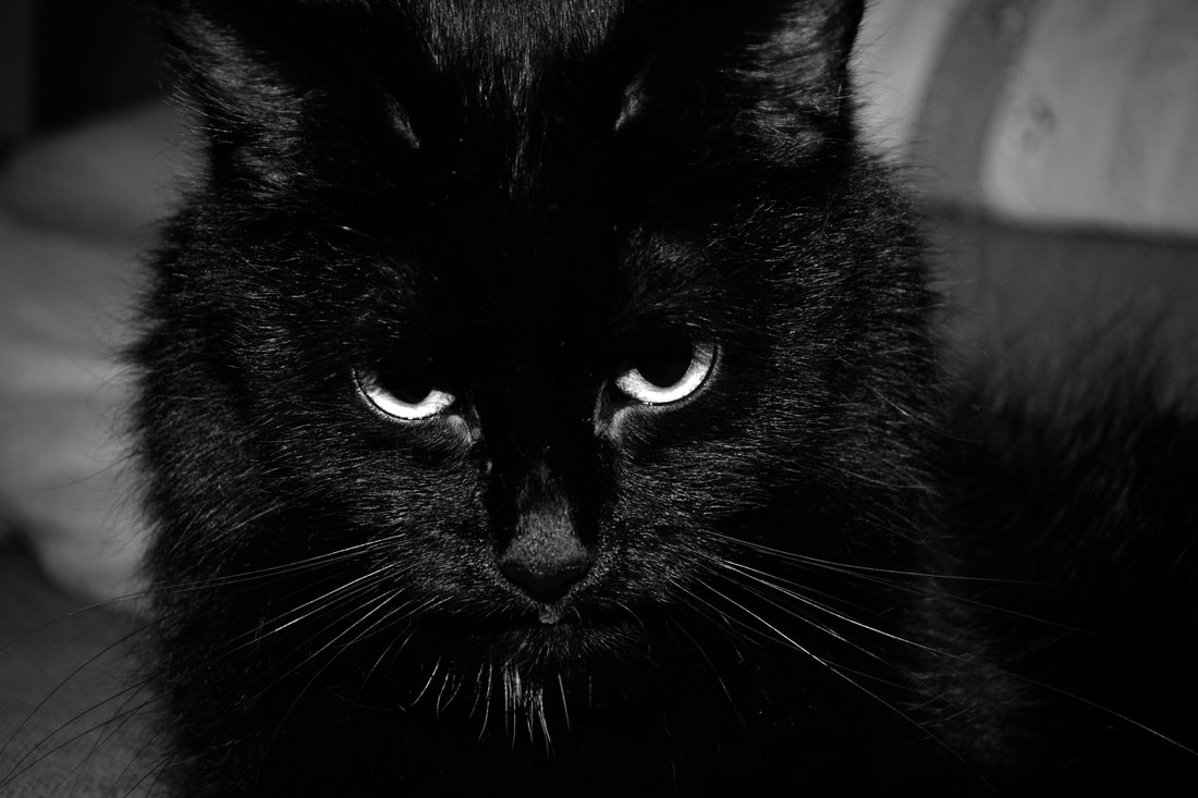
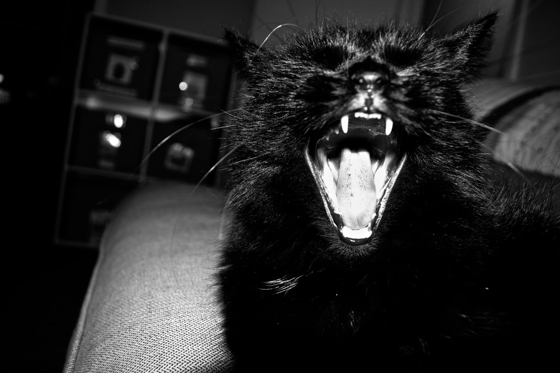
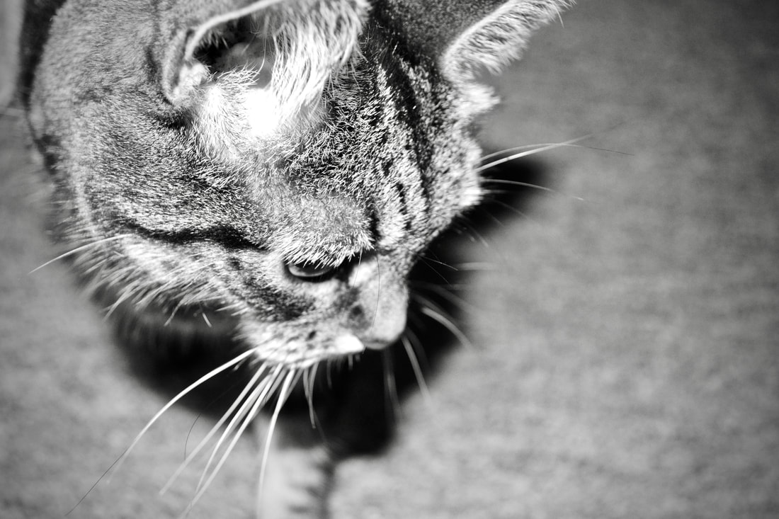
My theme for this homework is natural edges and unnatural edges and the contrast between them. I have thought a lot about if these photos fit the description of the key words and overall I think that they mostly came out quite well. For example the photo in the cave with the hole in the ceiling fit quite a lot of the key words like texture and colour as you can see the rocky texture of the walls and the cave is filled with a purple glow. Lots of the photos in the project are based on texture and pattern like the ones of the blankets. and the one of the close up speaker of the radio. However I would vary some of the photos as some some of them are quite similar however this is because of the amount of photos i had to take at such a short notice.
My theme for this homework is natural edges and unnatural edges and the contrast between them. I have thought a lot about if these photos fit the description of the key words and overall I think that they mostly came out quite well. For example the photo in the cave with the hole in the ceiling fit quite a lot of the key words like texture and colour as you can see the rocky texture of the walls and the cave is filled with a purple glow. Lots of the photos in the project are based on texture and pattern like the ones of the blankets. and the one of the close up speaker of the radio. However I would vary some of the photos as some some of them are quite similar however this is because of the amount of photos i had to take at such a short notice.
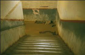
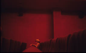
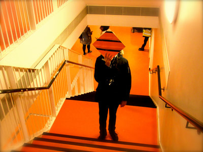
I would say that these photos by Dolores Marat I have been presented with are great as their muted colours are very good and I like how each photo has an overall colour and a limited colour pallet. It seems as if it is a theme for her photos to be out of focus but I would say that this is due to the decisive moment, which is the moment where a photographer sees what they want to take a photograph of and sometimes they have to take the photo quickly as their subject may move. However in some situations this is okay and can actually add to the photograph. For example one of her photos is of a homeless man laying at the bottom of the stairs of a train station and since it is out of focus it adds to the photo as it is at an imperfect location and an imperfect situation.


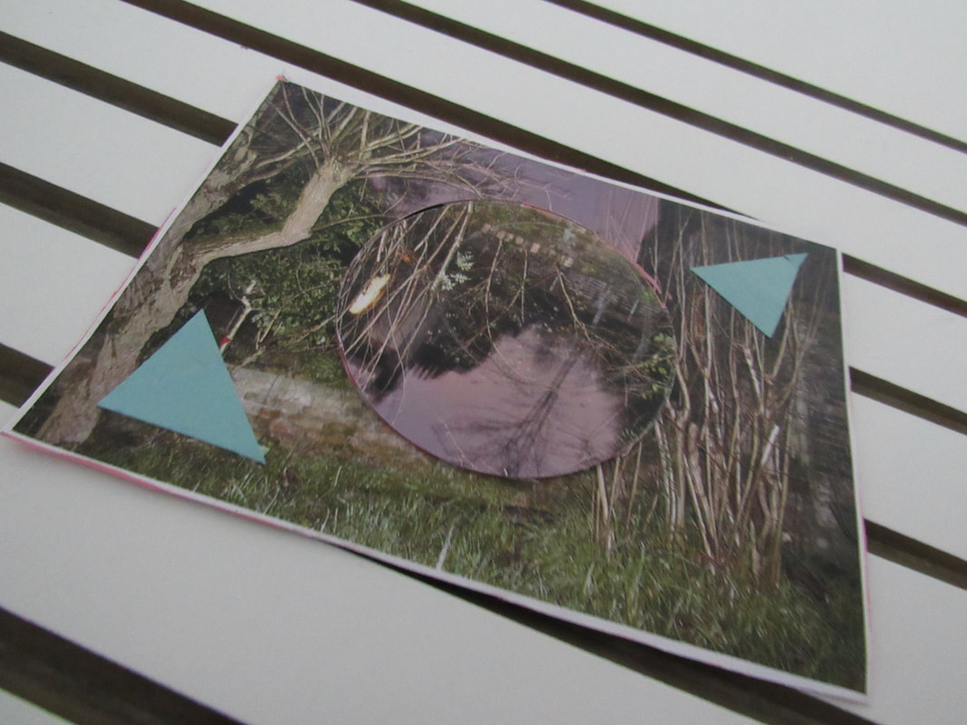
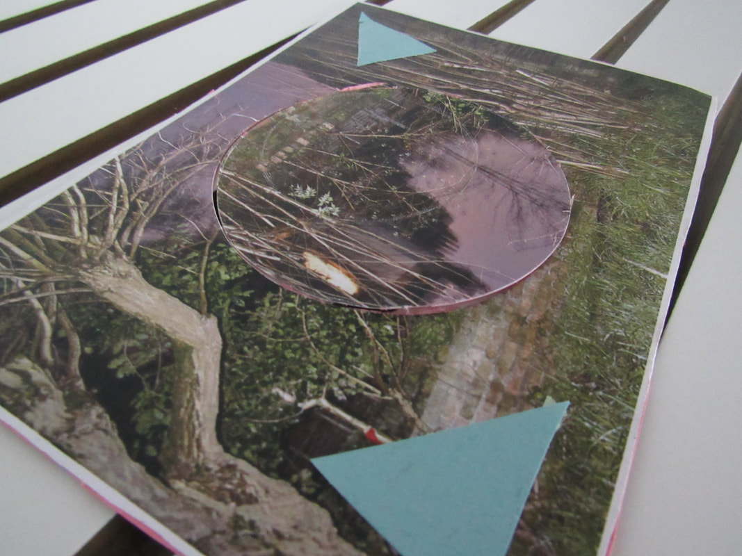
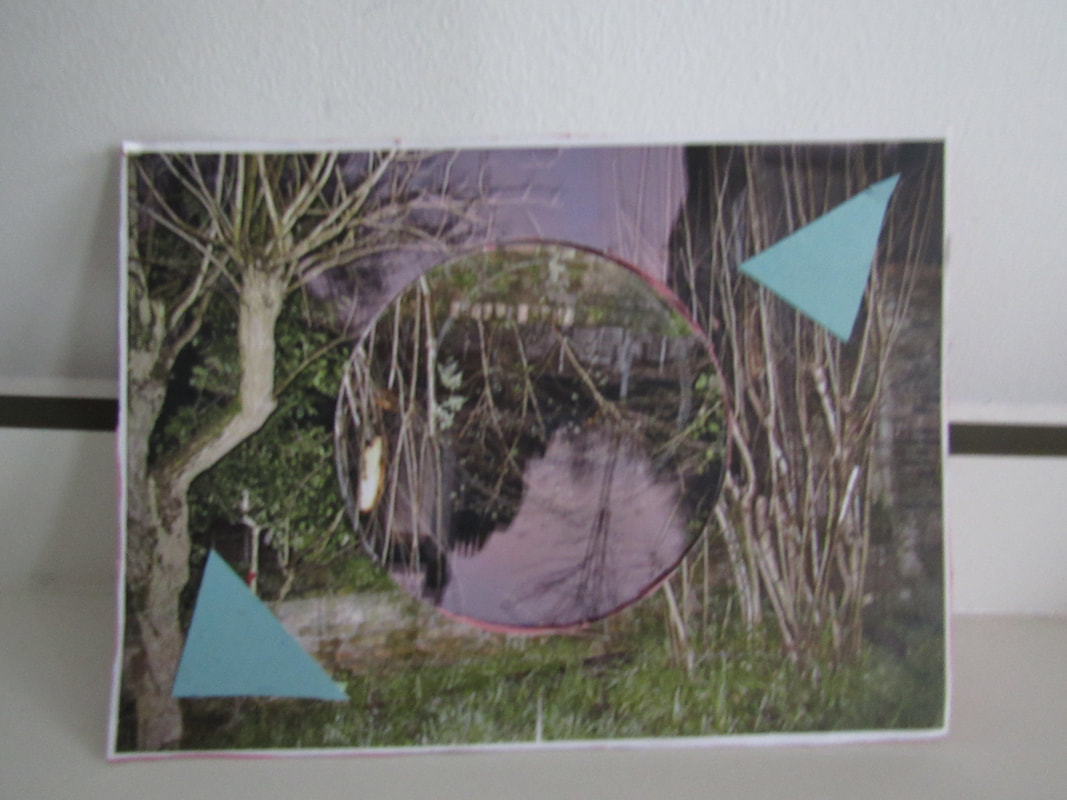
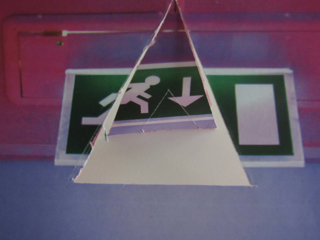
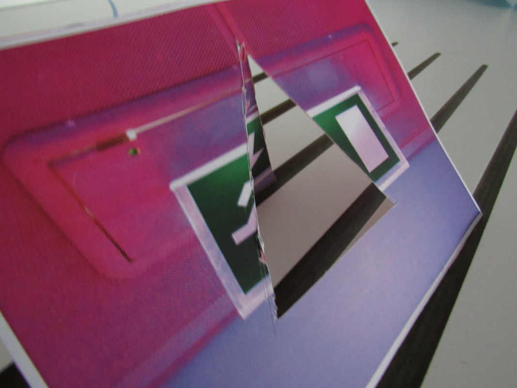
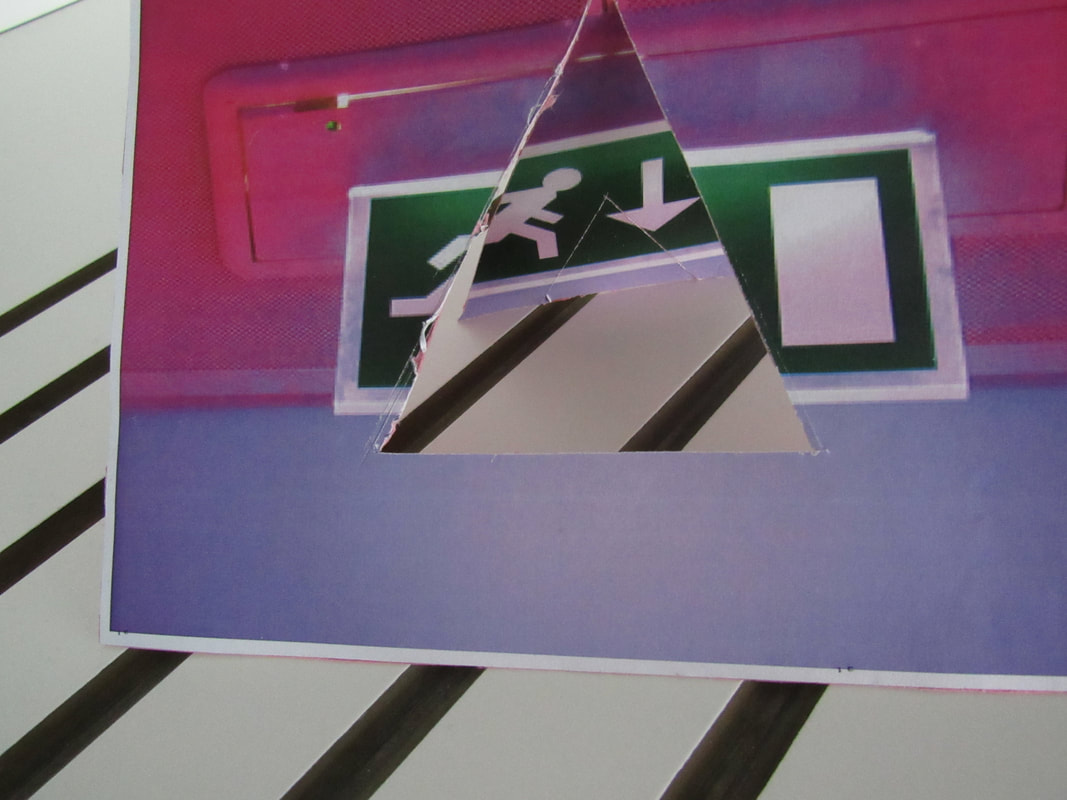
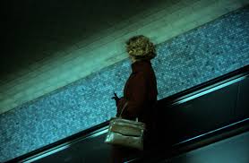
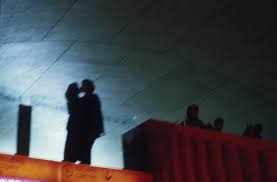
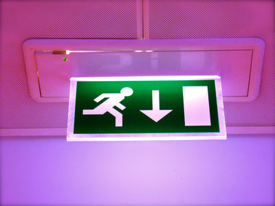
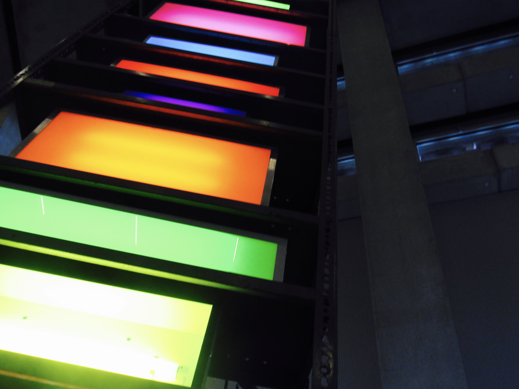
These are my photos based on the works of William Eggleston, overall I think my work is a good representation of his style. I would say that I took into account his use of vibrant colours and interesting composition, which were my main focusses, however I feel like I could have done better by varying my photos more. I would say my favourite of the images is either the one of Kiwi holding up the mirror (the one with colder colours) or the one with the fire exit. I think the fire exit one is so high up on my rankings as it was originally a very bland image but then I edited it on iPhoto and added the purple tint and saturated it and I think makes it a lot better. I found the task challenging yet fun as it I feel like I am improving and is my best project so far. I tried to vary the composition of my work a lot because this is what Eggleston does himself. I think that I framed my work well and similar to Eggleston. Overall I think this is an alright project.
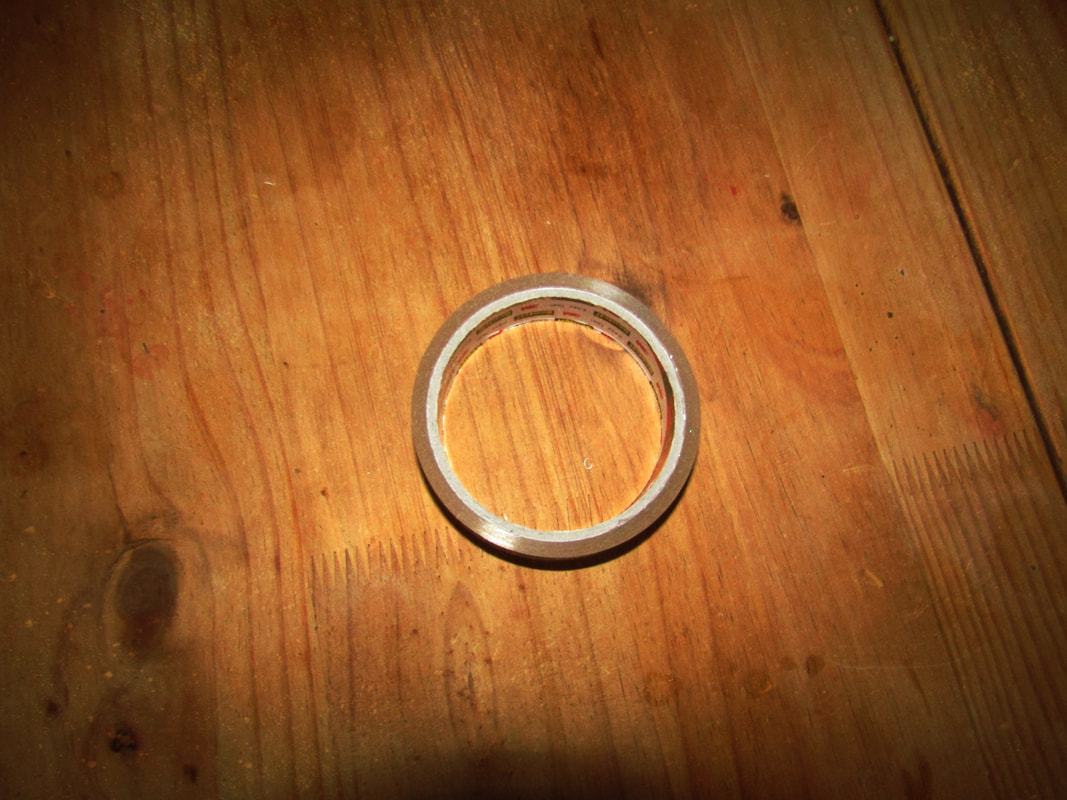
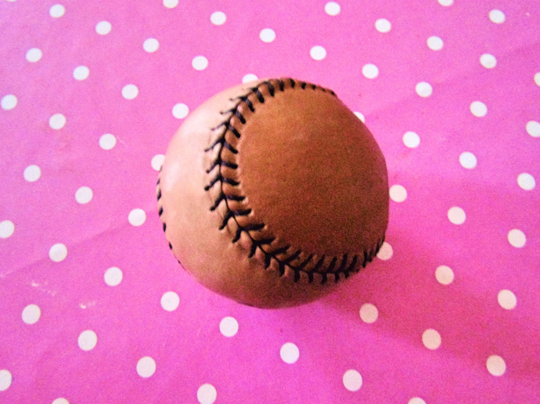
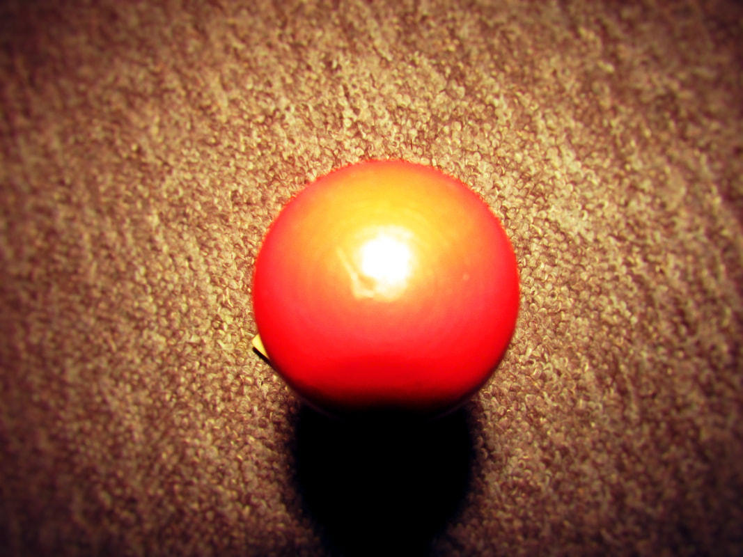
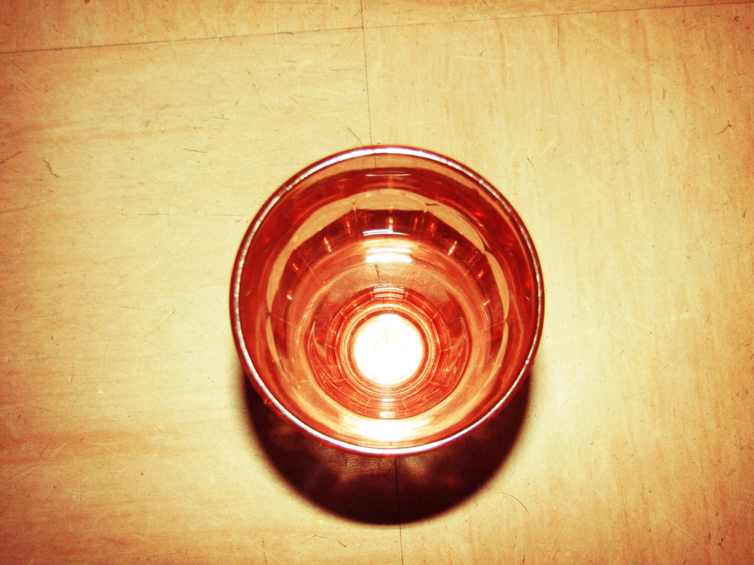

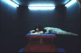
These are my images from my homework accordion book that I completed over the Christmas holidays. I based this on the works of William Eggleston and as you can probably tell it has the theme of circles and it is also all set inside my house. Overall I think it came out very good, my favourite is the one with the baseball as I think it looks quite like Eggleston's work for example the vibrant colours.
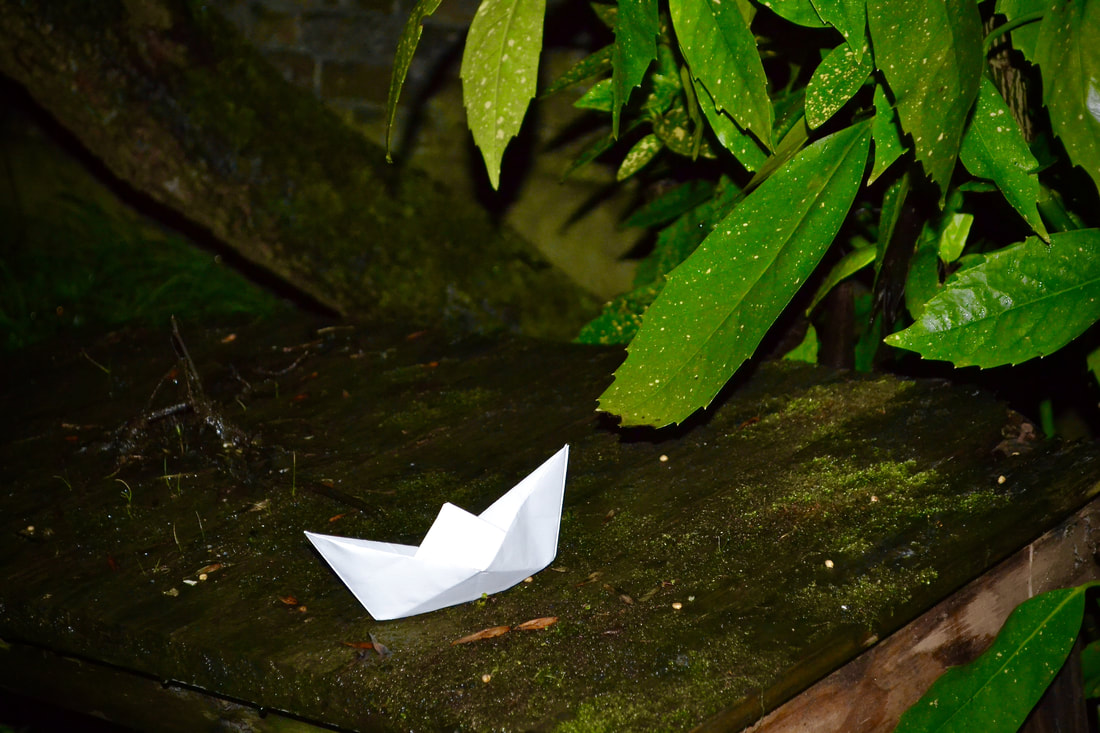
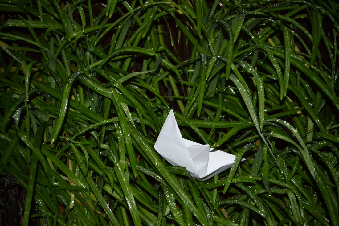
This task I have just completed is about creating your images as you can't constantly just wait for a good photography idea come up so being able to make something to photograph. We had to create 3d sculptures made out of coloured paper and card, we also had a post-it note with something to focus on, mine said "line" so that is what I based my structure and my photos of it on. Overall I think that my final model looks quite good as it full of different shapes, colours and most importantly different lines. Then I had to take the photos, one of the most difficult things I had to do is deciding what I wanted the background to be, the background is the main factor of how the photos are varied.
WWW - I think that the photos look good and the sculpture looks good
EBI - I think that my sculpture could have been more complex and I think that my backgrounds could have been a bit more varied
WWW - I think that the photos look good and the sculpture looks good
EBI - I think that my sculpture could have been more complex and I think that my backgrounds could have been a bit more varied


These are the photos that I have chosen to create my sculpture of my previous photos because I think they are my best work and they also have photos from the start so you can see the progress there has been to get to this point.
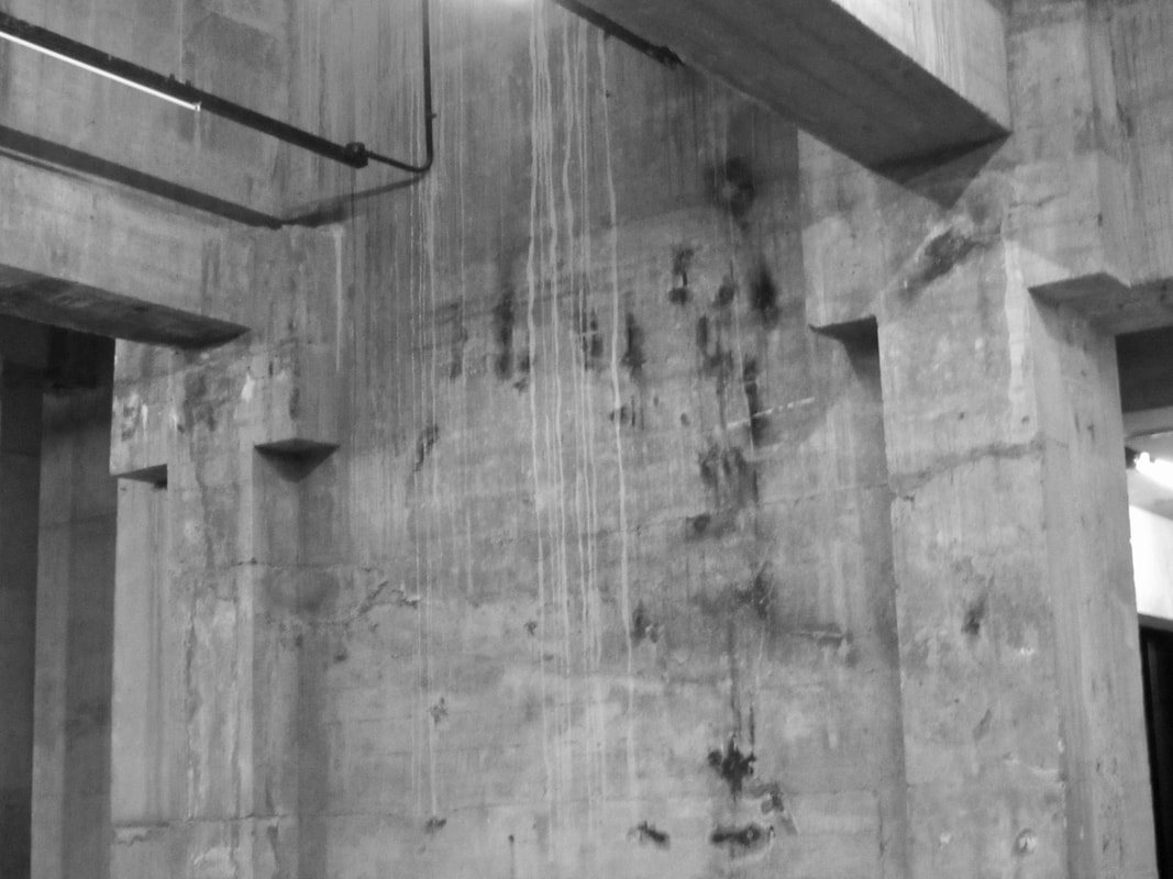
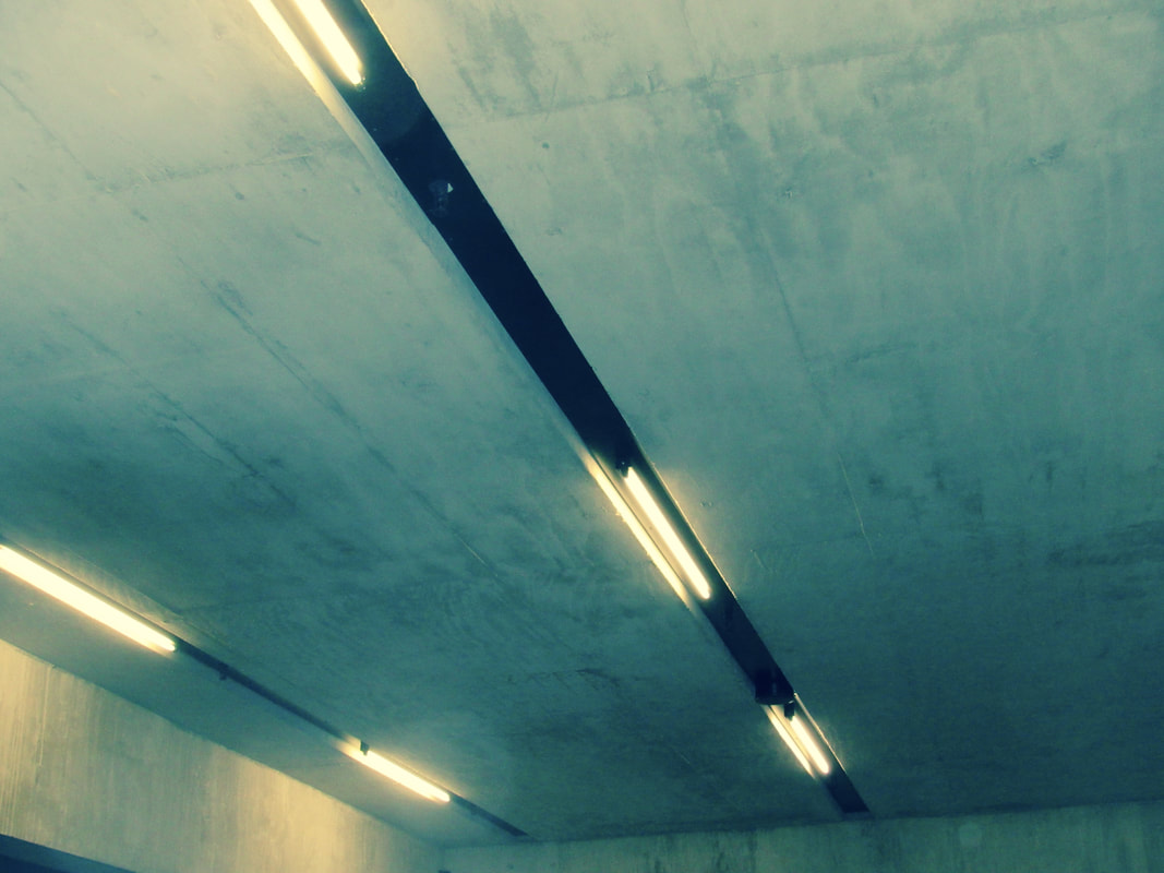
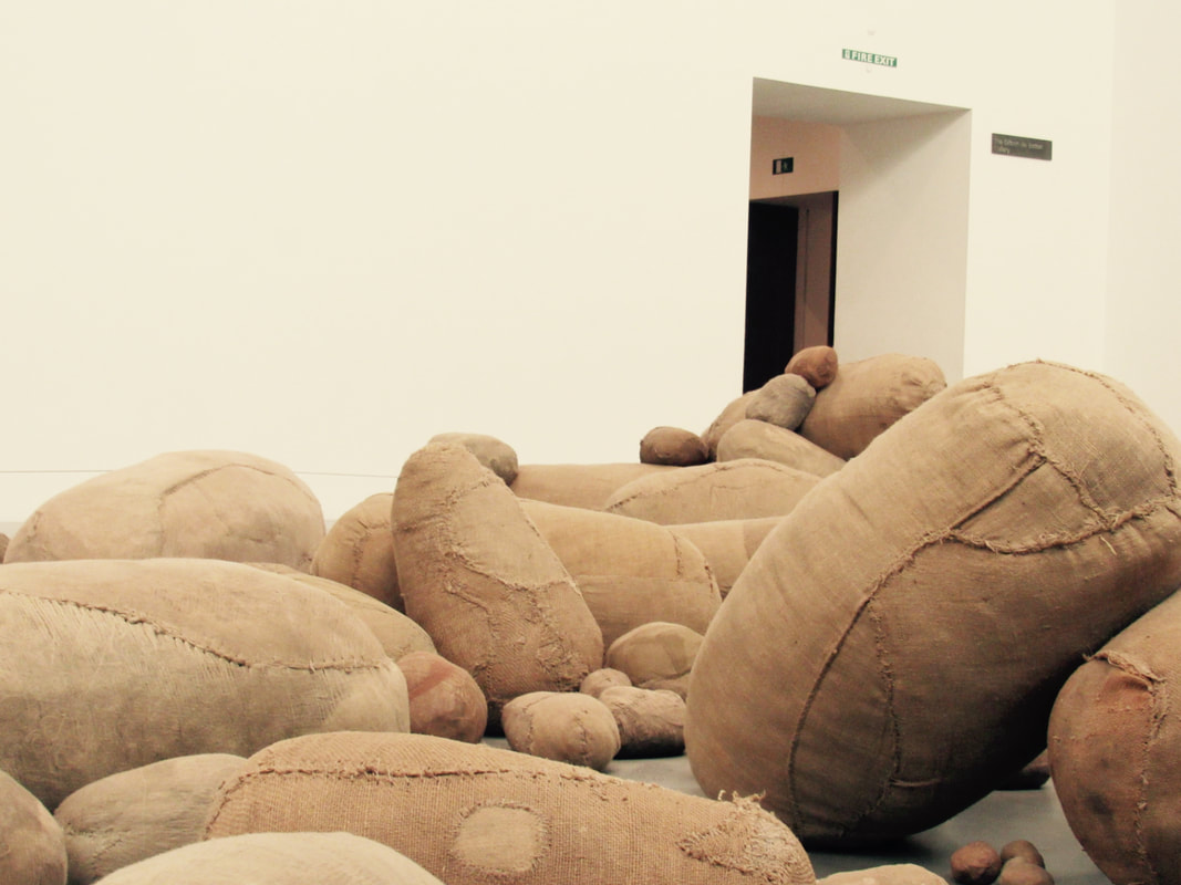
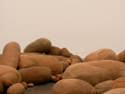
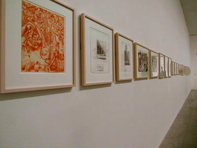
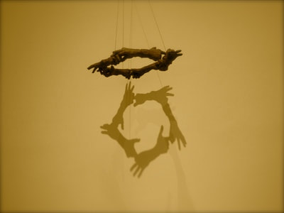
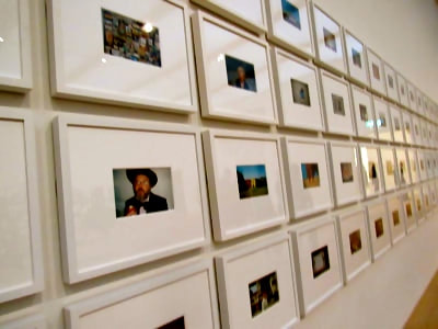
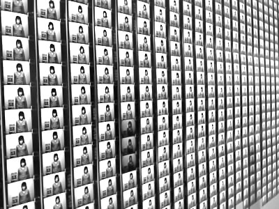
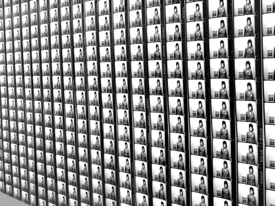
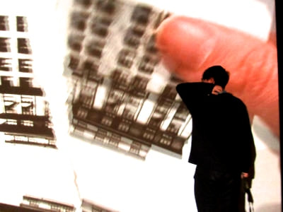
These are the photos that I took at the Tate Modern. The Tate Modern is Britain's national gallery of international modern art and holds a collection of art from 1900 to the present day and is one of the largest museums of modern and contemporary art. It is located within the former bankside power station. when we went I was astounded with the quantity of work. One of my favourites has to be "One Year Performance" by Tehching Hsieh in which he took a picture of himself every hour for a year between 1980 and 1981. Here is a video about it.
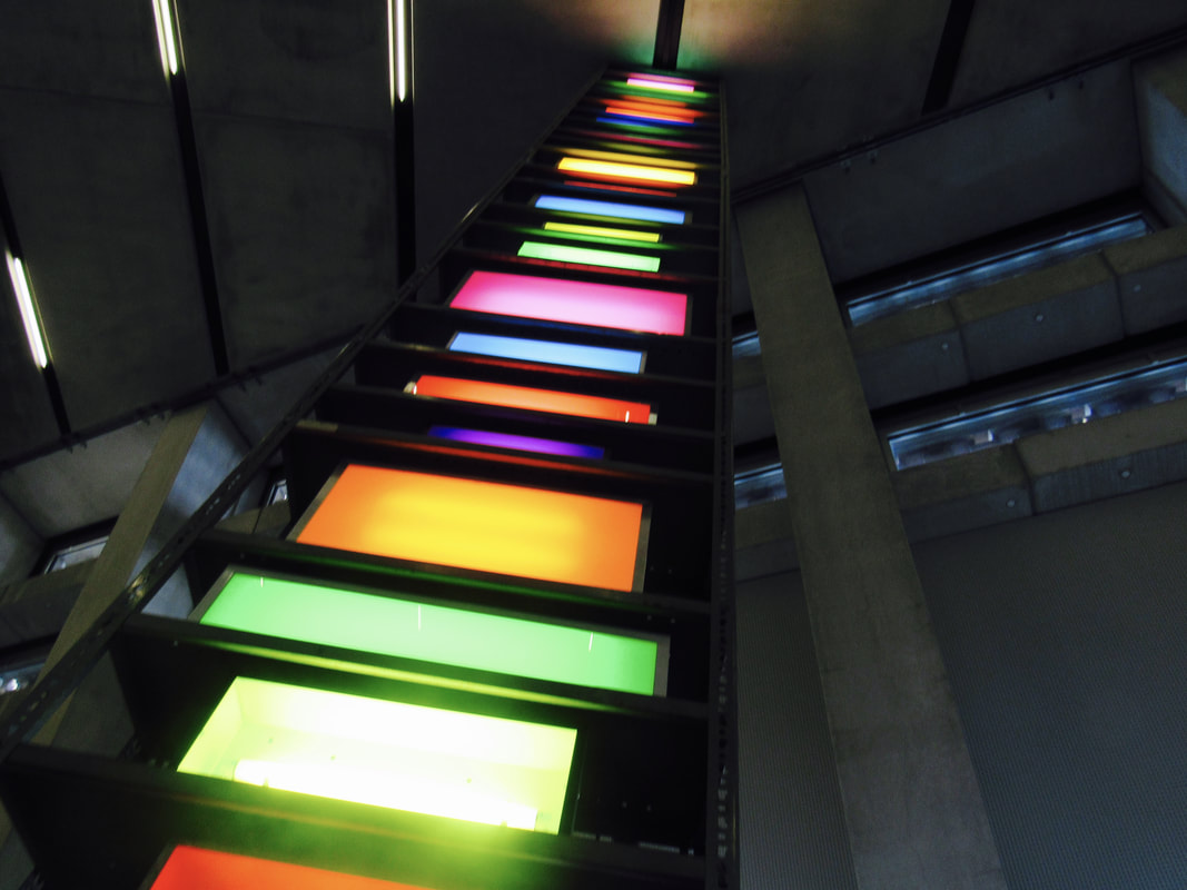
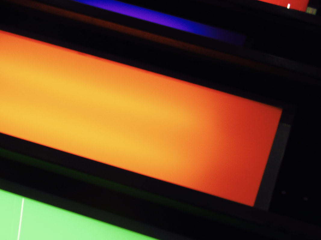
This really seemed amazing that someone could take 8760 photos over the course of the year and I would like to do something like this however I don't think I could ever do anything as extreme as this. This was just one of a lot of amazing, strange complex and simple pieces of artwork in this wonderful gallery. Another thing I liked in The Tate Modern is superflex an artwork made and installed by Hyundai. It is a long orange metal bar bent across the turbine hall with swings attached for more than one person. This might be a bit difficult to visualise so here is a YouTube video about it
This is seems amazing to me especially the giant metal ball all of this is a big mix of complexity and simplicity and it is just a brilliant work of art and deserves to be in the famous turbine hall of the Tate modern. I would say that this is inspiring for me which it definitely is however there is no way that I can do anything to this scale for many many reasons.
Exhibition
These are the pictures that I used for my exhibition
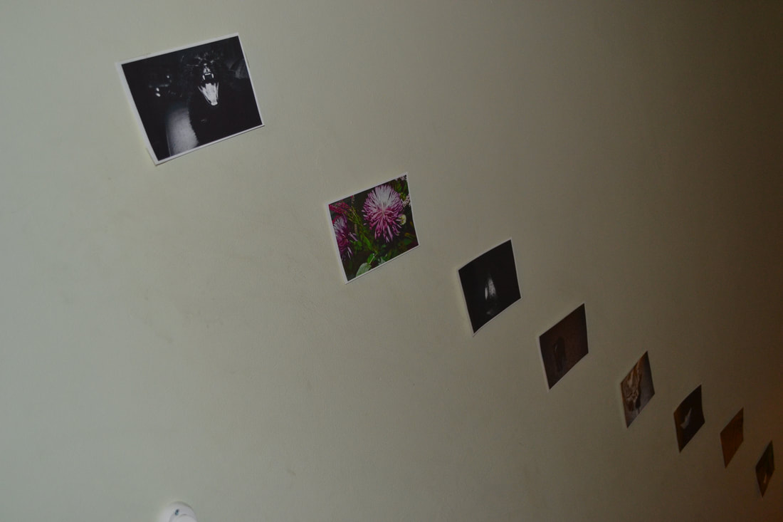
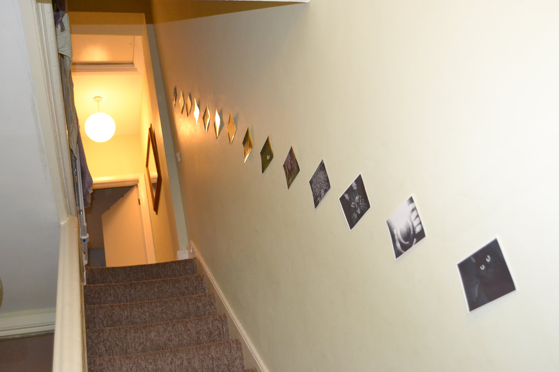
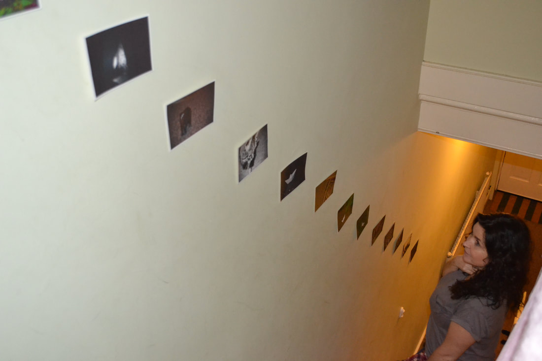
This is my exhibition being exhibited, one photo for each step.

This one is my favourite of all of the pictures I took
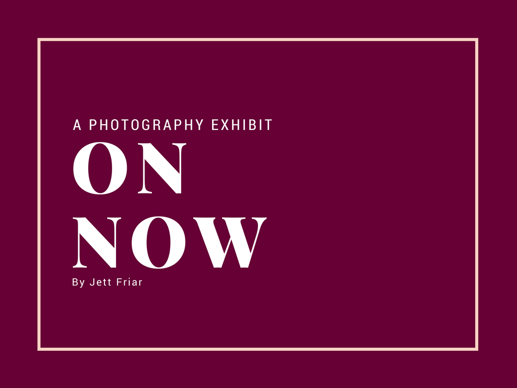
My poster for the exhibition