
I chose unusual portraiture because it is a subject that I haven't really explored portraiture, I also liked the photos that I saw on the Pinterest board of unusual portraits that was shared. Throughout the subject I'd like to try a multitude of different concepts and take inspiration from many of the key photographers. I think that I'm mostly looking forward to using a wide variety of techniques and materials in order to be creative. It will also be a great opportunity to use Photoshop and similar applications.
Portraiture
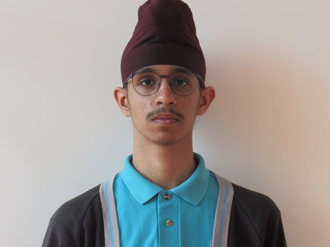
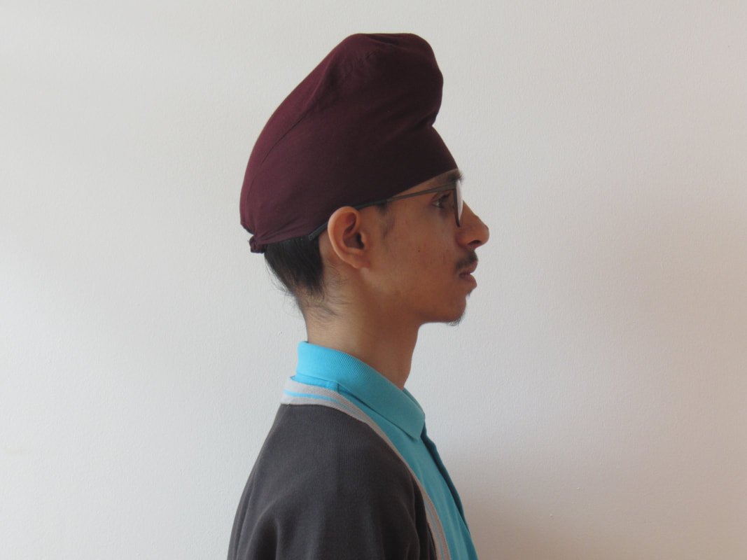
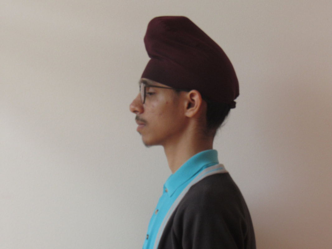
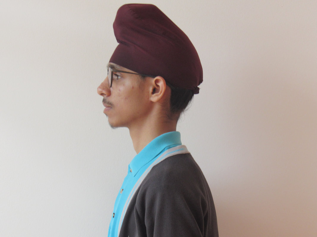
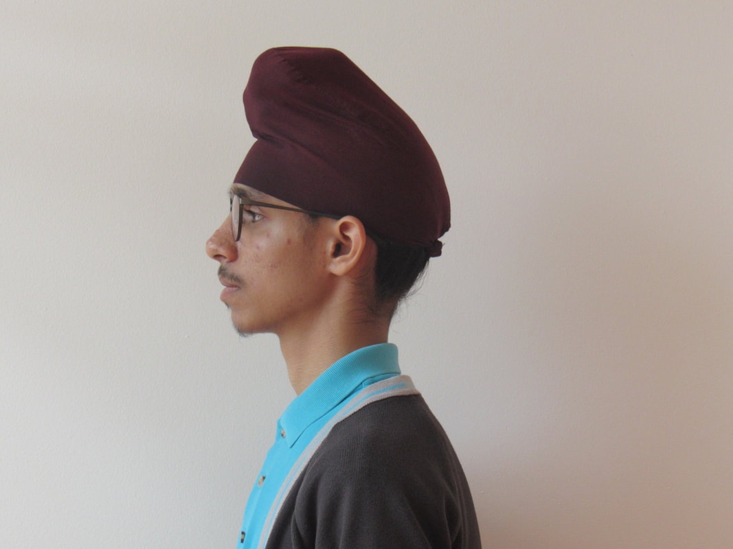
These are some of my previous experiments with portraiture. These are some images that I've taken for various projects. I wanted to look at them so that I can see how I've approached photography previously. Here are my favourite pieces of portraiture and self-portraiture from earlier in my photography portfolio. I think that I have completed a lot of good work but I think that I can achieve more when I am specifically focusing into this genre of photography. The one that worked well and interests me the most is the one taken from the Tate Modern gallery. It looks like the student is super-imposed on top of the image but its actually taken in front of a screen. I like working with Photoshop so inspired by this I'd like to do a similar experiment.
Lola Dupre:
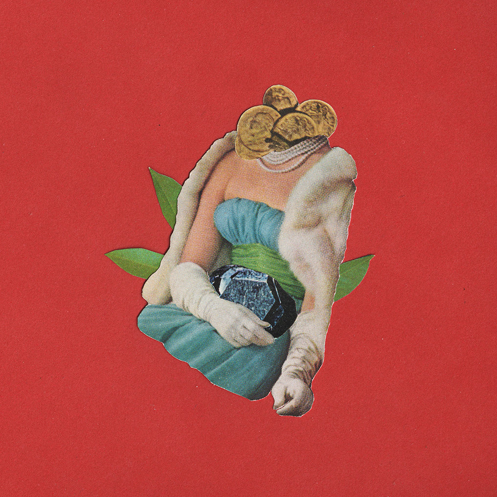
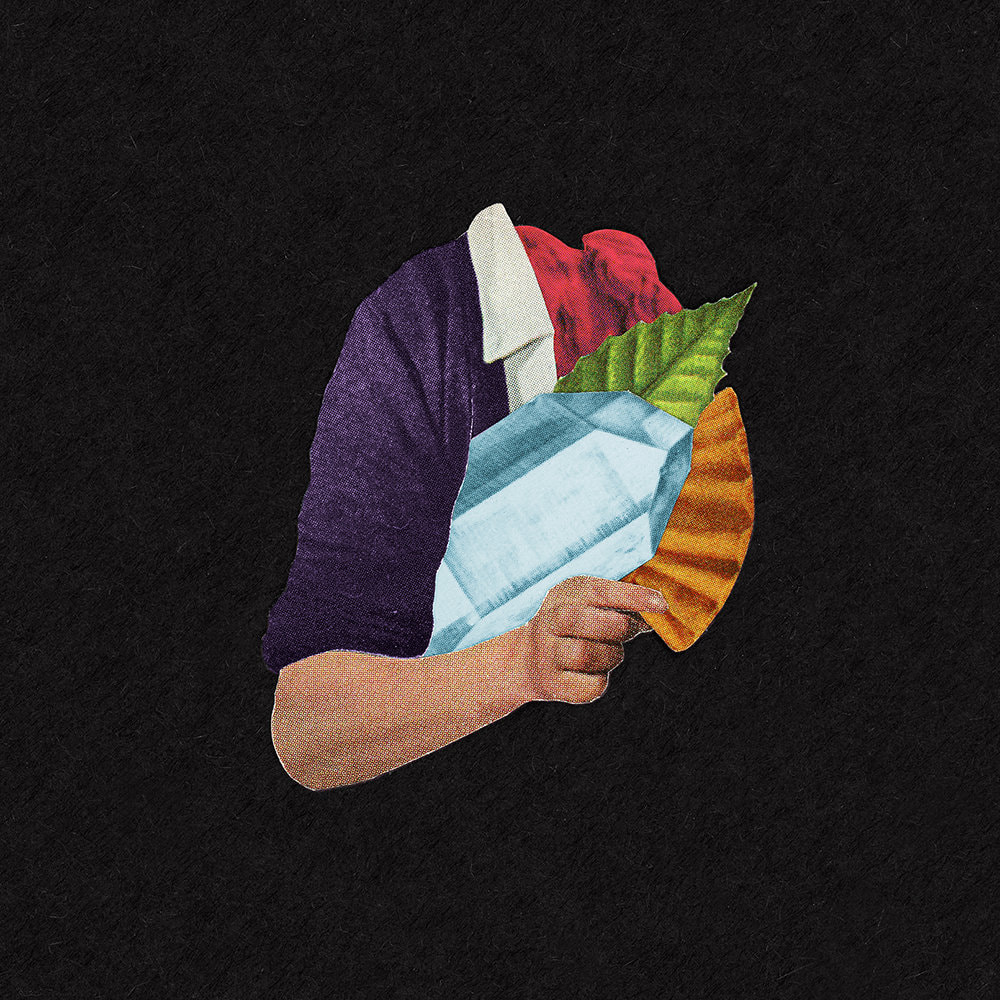
I chose Lola Dupre because I thought that her images really fitted the theme of unusual portraiture and these photos are also very well done, they are accomplished not with photoshop but with collage and the result are these really strange almost photorealistic yet distorted images that make you feel uncomfortable. I think that I could try to do something like this through photoshop but I don't think that I could get it to be as good as this.
I chose Lola Dupre because I thought that her images really fitted the theme of unusual portraiture and these photos are also very well done, they are accomplished not with photoshop but with collage and the result are these really strange almost photorealistic yet distorted images that make you feel uncomfortable. I think that I could try to do something like this through photoshop but I don't think that I could get it to be as good as this.
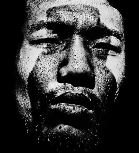
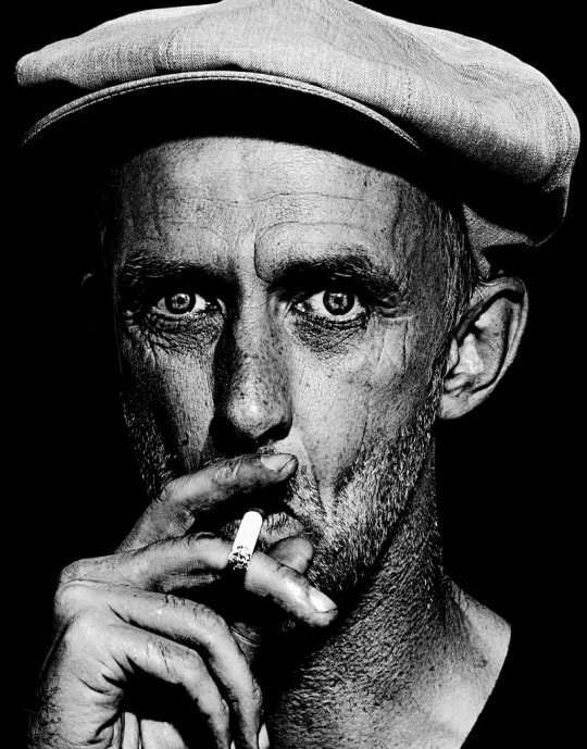
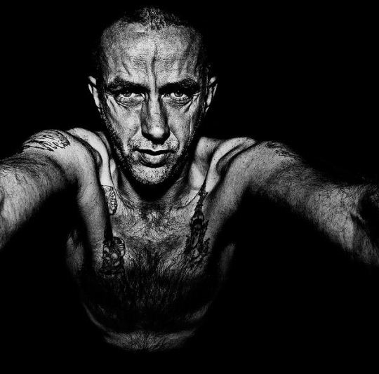
Brett Walker
I chose Brett Walker as another photographer as he is the opposite of Lola Dupre he focuses of very real and human photos and his photos show a lot of emotion, the photos are very close up and you can see the details of the portrait subjects, I think that it could be possible for me to attempt something like this but I think that to achieve similar aesthetics I would need access to better lighting and maybe also a camera that can shoot in a higher resolution but I think I might try something that is in black and white or at least close up portraiture. Another thing I like about these photos are the black background and dark aesthetics which could be a possibility for something I might do.
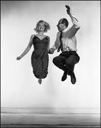
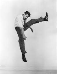
Philippe Halsman
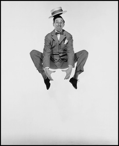
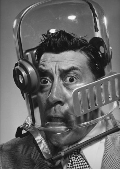
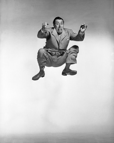
Philippe Halsman is the man behind some of the most well known portrait photographs of all time, however I chose him because of some of his lesser known and more unusual portraits, I especially liked the photos of people jumping and I think I'd want to do something similar to that, I'm thinking that I could take pictures of people in the middle of anything. He also uses the technique of shooting really close up in some of his portraits. I also like the white backgrounds in his photos and that would be easy to replicate in the classroom.
Sam Taylor-Wood
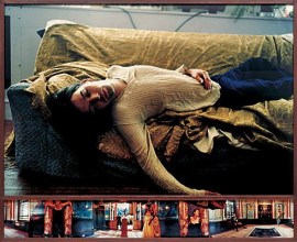
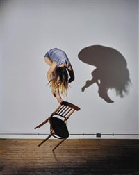
I chose these images because I think they are aesthetically pleasing in different ways, for example I really like the second one across called Soliloquy IV because of the deep and warm colours, the sense of movement and the composition of the main photo and the long panorama at the bottom but I also really like like her chair photos because of the simplicity and the composition of the person, the chair and the shadow. I would like to try photos similar to both types of photo.
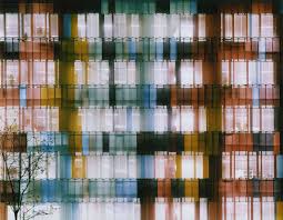
SALES album covers by unknown artist
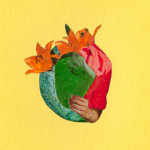
I really like these album covers because of their simple idea but impressive range of colour and all of the abstraction is concentrated down into the centre of the frame giving an interesting contrast between the subject of the photos and the striking colours of the negative space of the background. I would definitely like to try to produce work similar to this and I think that I definitely could through the use of photoshop.
Single Photo Analysis
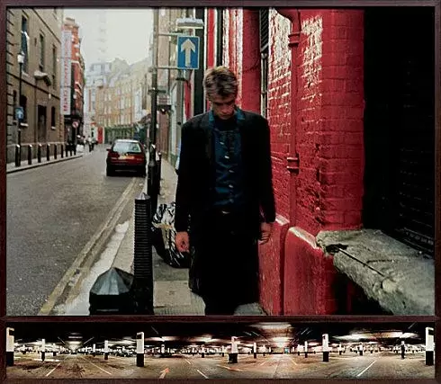
This photo is my favourite that I have found during my artist research, I think that the vivid colours mixed with the movement mixed with the panorama at the bottom portrays the feeling the subject of the photo is feeling, in my opinion the photo shows the feeling of warmth but also loneliness. I would like to explore similar looking places in my independent photography and I would also like to explore the themes of colour and movement in the way that Taylor-Wood has. I think that the location is a key aspect to the photo and that's why I think that I should keep that in mind when I am taking my pictures outside of school. Overall I think that besides pushing any key themes there is no
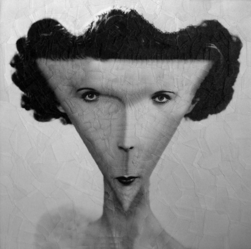
Second single photo analysis
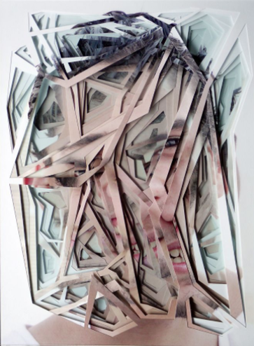
In this photo by Lucas Simoes I can see a face that has been printed onto many pieces of paper that has been cut up. I think that this photo is very visually striking because although it is very difficult to pick out individual features that make up a face, we can see clearly that is a person. I would also say that the layered prints gives the photo depth which creates a unique and aesthetically pleasing look, it looks as if it is an extreme topographical map. The photo is so unique because it's distortians are jagged and angular as opposed to the smooth distortians of his and other other photographers works, it is chaotic yet we can see that is carefully constructed. The colors in this photo are very simple and muted yet aesthetically pleasing we see a pale pink for the skin, a deeper pink from the lips of the subject contrasting with the blacks and greys in the hair and the off white of the background if there were any more vibrant colours in this piece i think that it would distract from the technicality seen in the composition of the photo. Another thing that I think makes this photo so striking is that you can't tell what the facial expression of the subject is, this adds to the unusualness of it as the viewer doesn't know what they are looking at and what to make of it. I think that this was intentional and creates a very unique feel that I haven't seen in other photographs. The photo has also been cropped quite close to the face as there is nothing in the background to distract as this photo has a very clear focus of the photo and the cuttings.
I think that I could make responses to this image as I do believe that it is a very good idea however I think that it would take up too much time and I know that I would not be able to execute it as well as Simoes does it as there is a lot of things I would need to figure out including the precise cutting, I also have no original ideas of how I could expand on this image so I feel that I would just create something very similar to this but with worse quality so I think that it could just come off as a bad rip-off of this piece and I really love this piece so I would not want to create a lesser version.
Overall I really love this piece, I think that as you look further into the intricacies of the layering and the colouring and the individual fragments of what was a face, you can really see it as it beautifully is, I would love to see more photos in which it is carefully constructed around a good idea with all aspects of the formal elements accounted for and I would also love to try and accomplish something that involves these parameters.
First Idea

Note: these aren't actually the image ratios of the real pictures, they have been cropped for the website however you can click on them and view how they are meant to look like
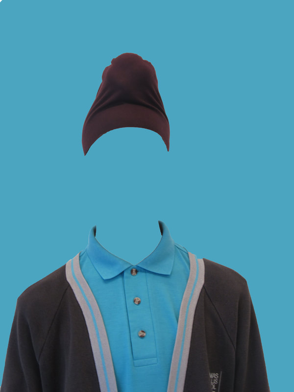
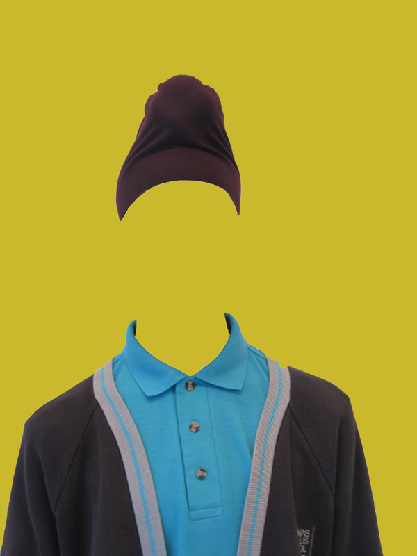
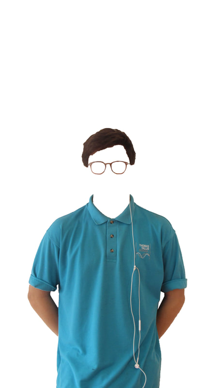
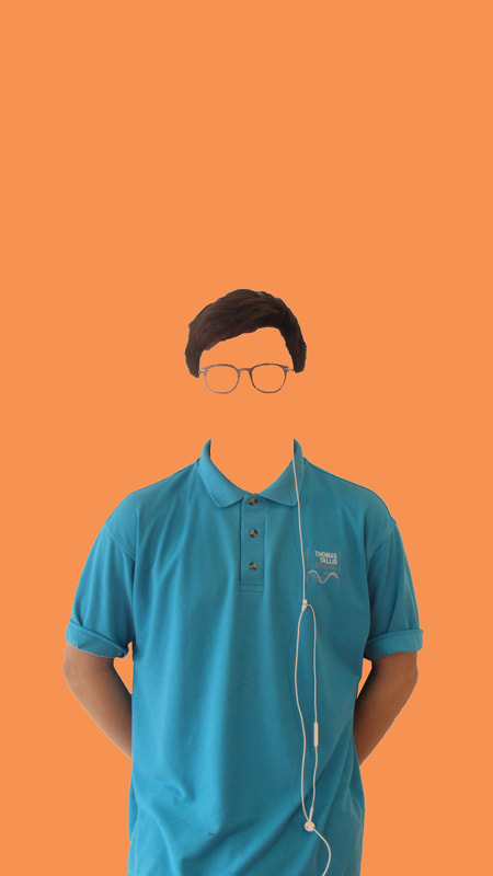
This is an idea I had for unusual portraiture, it was just the start of something that I might add onto, It would be easy to make this into a more fully fledged idea as I could do any number of things with colour because of the missing background or I could do something with shape or collage because all of the pictures have the same shape but for now I am fairly happy with how this has turned out so far but what I don't like is the fact is that all of the people are different sizes in the frame which would make it look worse if I were to try and join multiple people in a collage. However this could be easily fixed with a reshoot or cropping.
First finished response
I thought I'd try and create something through photoshop again as a second attempt so I took these photos of Harkeerat and I saw what I could do with them
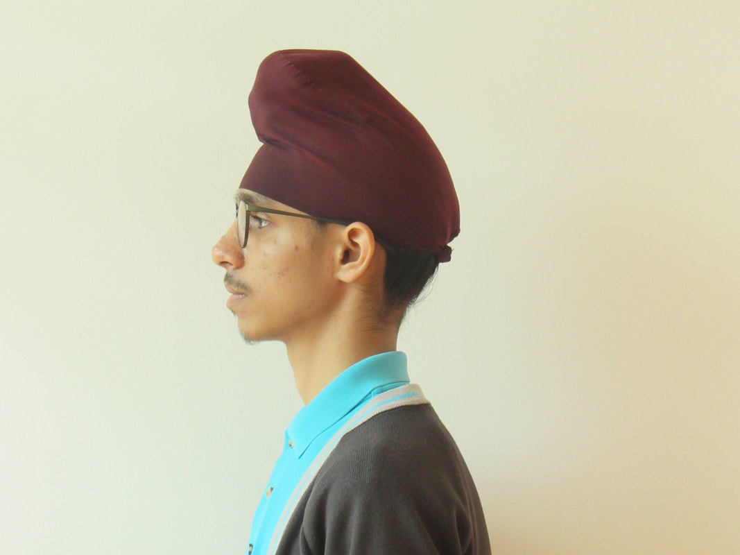
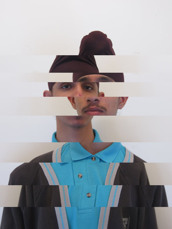
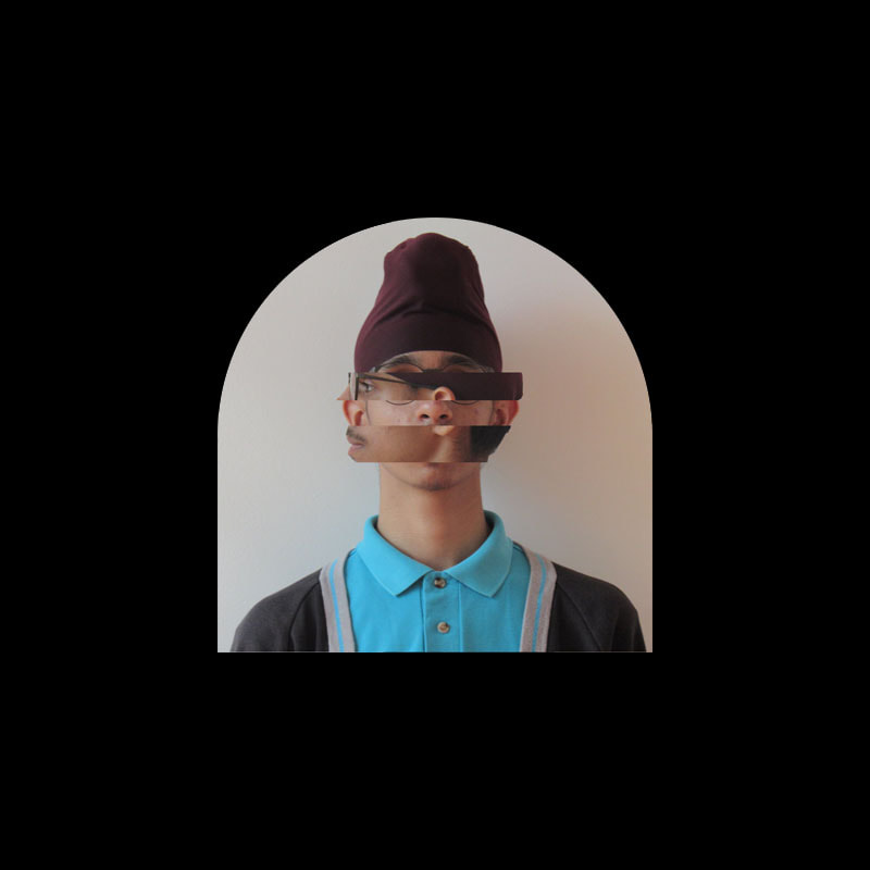
My first idea was to create a sliced face, with different sections of the face rotated, originally I was going to have the sections rotate in a clockwise direction however I concluded with a mix of the shot of him facing towards the camera and a shot of him facing towards the left and this was the product:
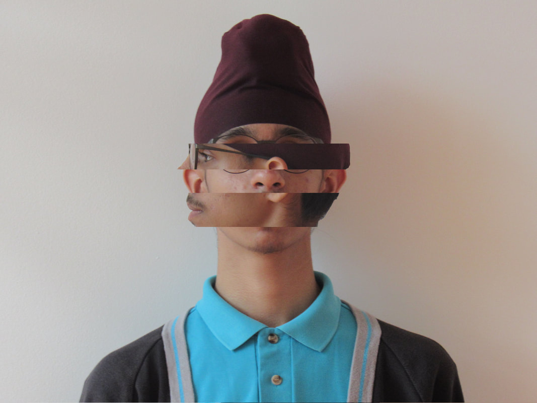
WWW - I think that this image came out quite well, I think that it is what I wanted it to look like for sure and I might make a full photo set with a similar style
EBI - Although I like how this looks it isn't as unusual as I'd want it to be, I would like a more original idea with more vibrant colours and maybe not taken with just a normal camera, however it could be possible for me to both do this whilst continuing the theme of this photograph. I also think I'd like to take portraits of people who aren't wearing the Thomas tallis school uniform as it isn't very interesting.
EBI - Although I like how this looks it isn't as unusual as I'd want it to be, I would like a more original idea with more vibrant colours and maybe not taken with just a normal camera, however it could be possible for me to both do this whilst continuing the theme of this photograph. I also think I'd like to take portraits of people who aren't wearing the Thomas tallis school uniform as it isn't very interesting.
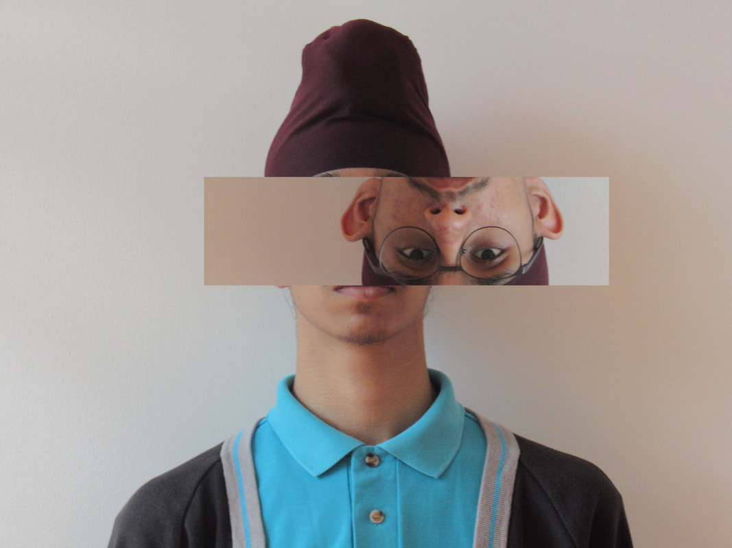
WWW - I think that these photos are also pretty good and they also fit the theme that the original photo sets out
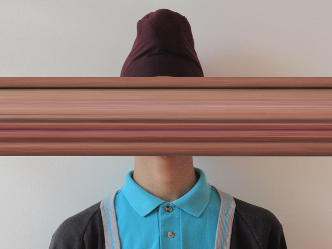
EBI - I think that these photos aren't as good as the original photo and I also want to do photos that are directly inspired by the work of someone else and make a variety of different style. I intend to create work inspired by Philippe Halsman
EBI - I think that these photos aren't as good as the original photo and I also want to do photos that are directly inspired by the work of someone else and make a variety of different style. I intend to create work inspired by Philippe Halsman
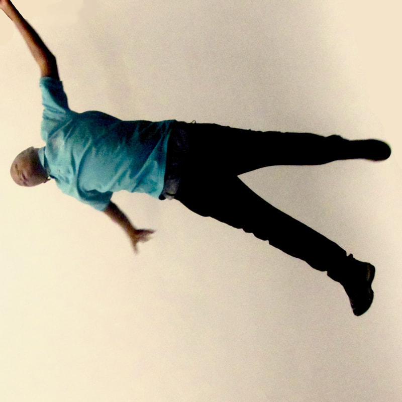
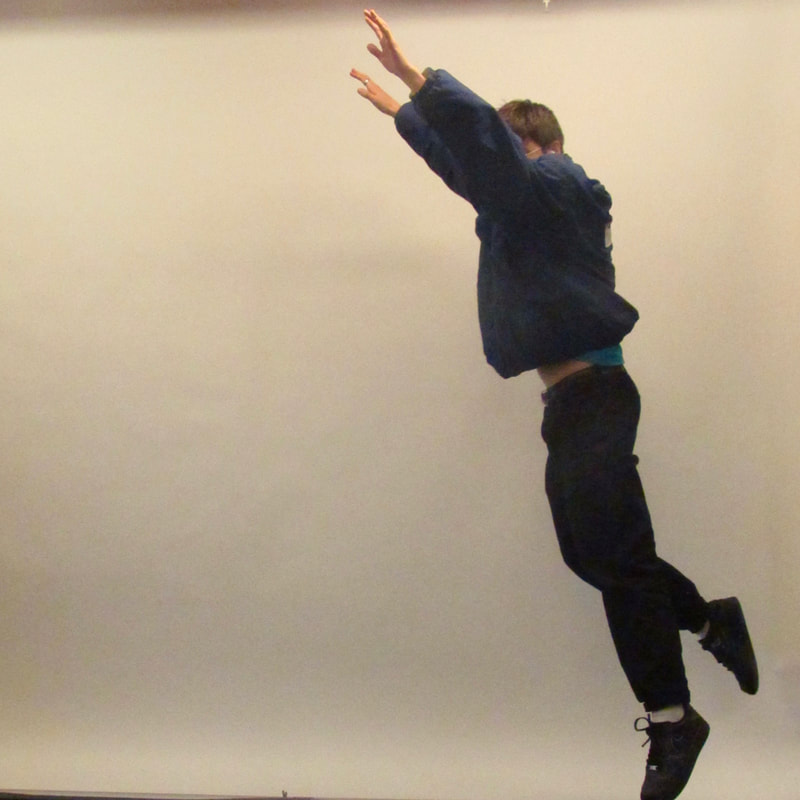
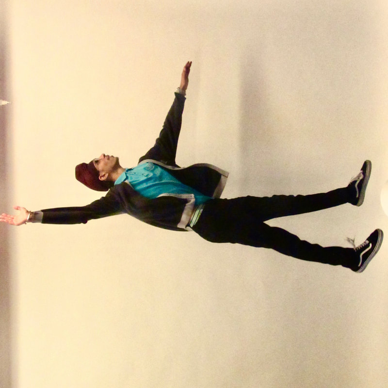
I took these photos as a response to Philippe Halsman's "Jumps" photos and I rotated the picture of Harkeerat and the one of Jide so it looks like they are falling.

I then edited the photos so the backgrounds would be smoother
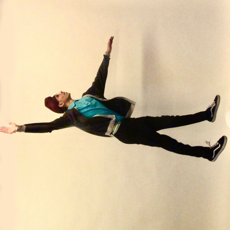
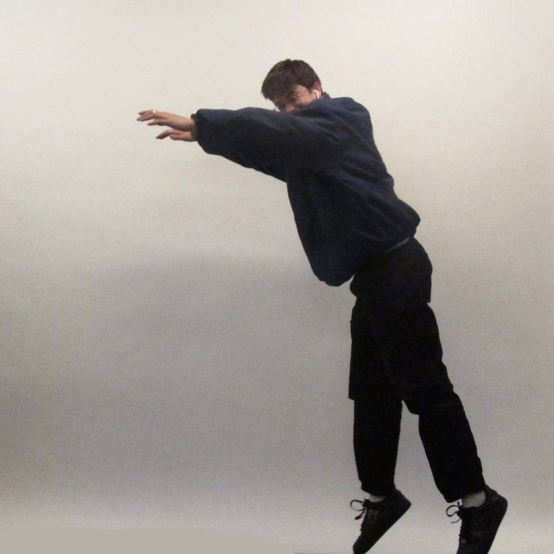
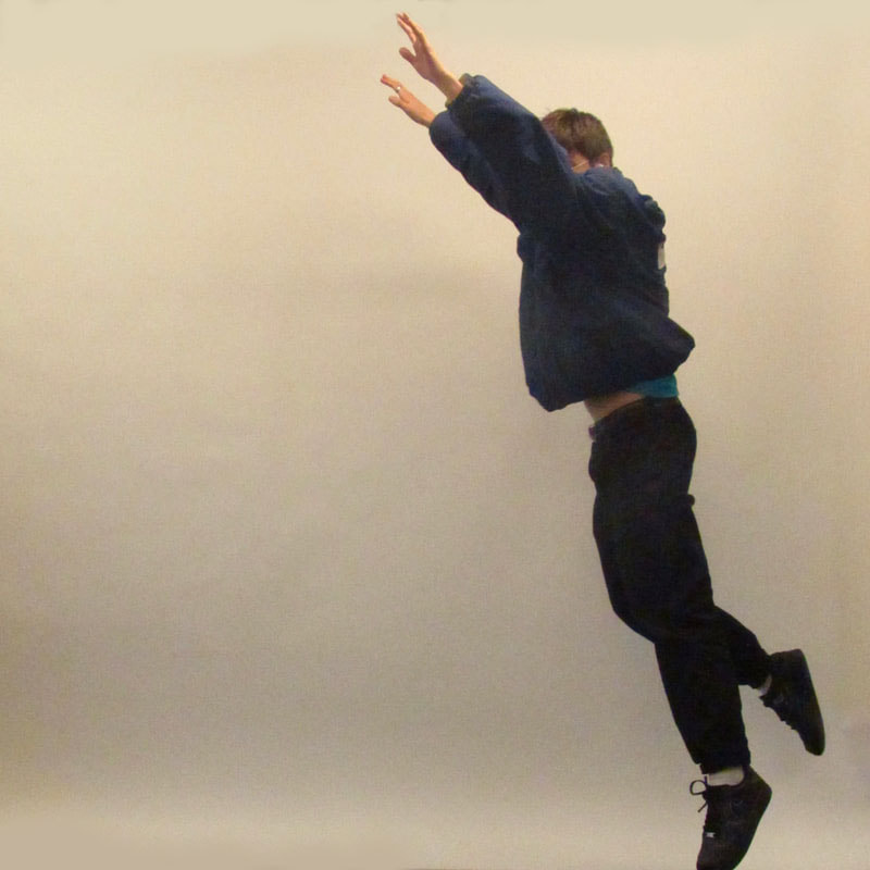
I think that the photos that I have taken are a good response for these photos. I like these photos because of their simplicity, Halsman takes such a simple concept and he adds such depth and variety in each photo, I tried to replicate the effects in my photos and I gave the focus' of the photos a lot of freedom in which they could choose how to jump. I think that this added a lot of variety and personalised each photo to their focus and I think that Halsman may have also done this to achieve the same effect. I also used the photo editor in photos to add contrast and saturation and also to overlay a red tint which I think adds to the photos. I also took this photo that although it doesn't fit with the theme of jumping I think that it looks very good partly because of it's symmetry
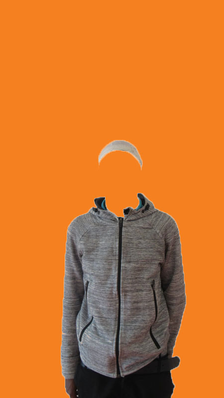
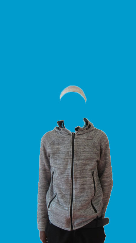
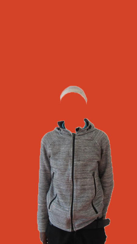
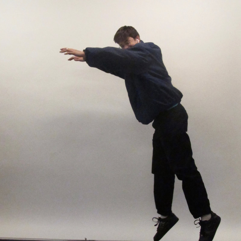
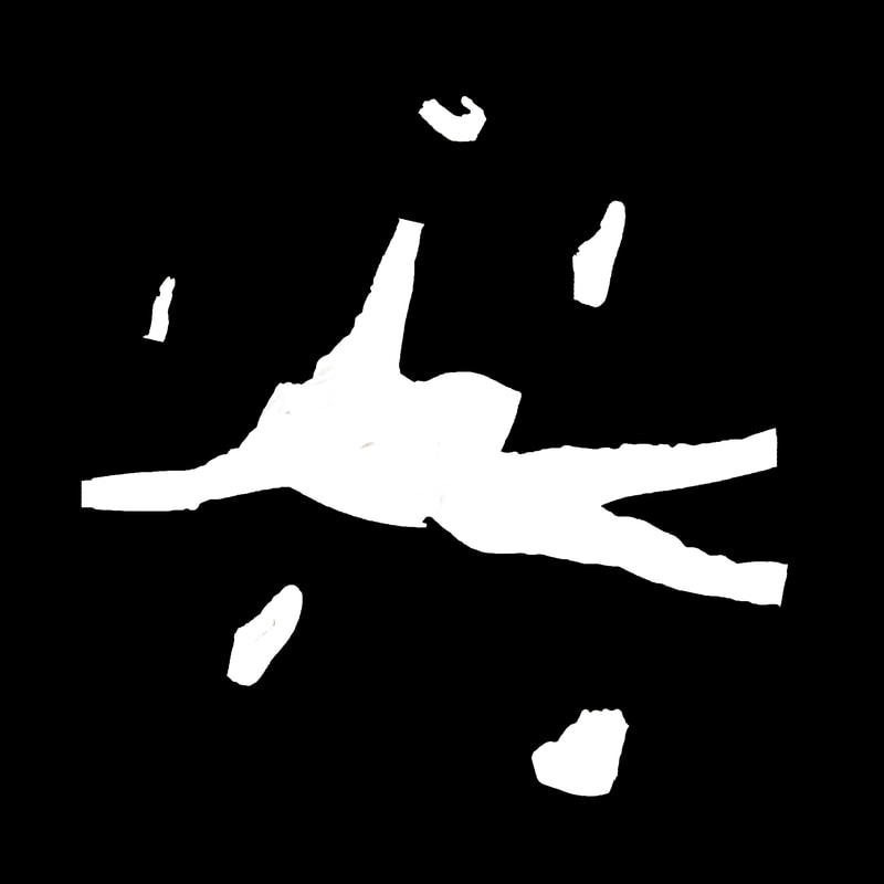
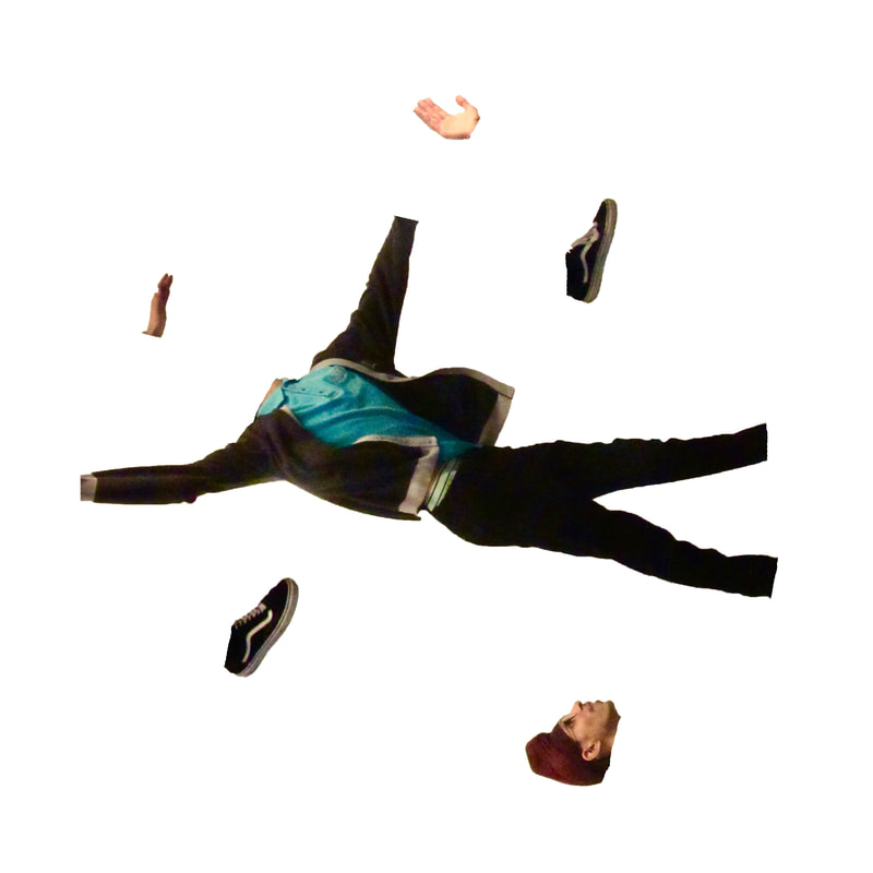
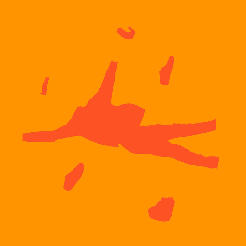
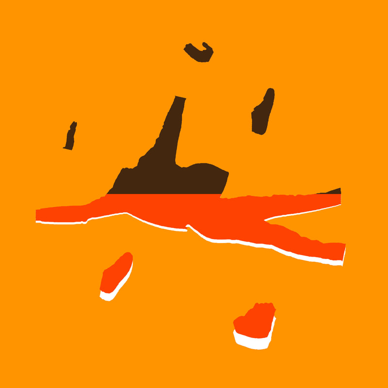
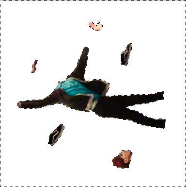
I then edited one of the pictures of Harkeerat with photoshop by removing the background and taking out his hands his feet and his head and moving them randomly around the photo. I used the quick selection tool to remove the background and the lasso tool to move the hands, feet and head around.

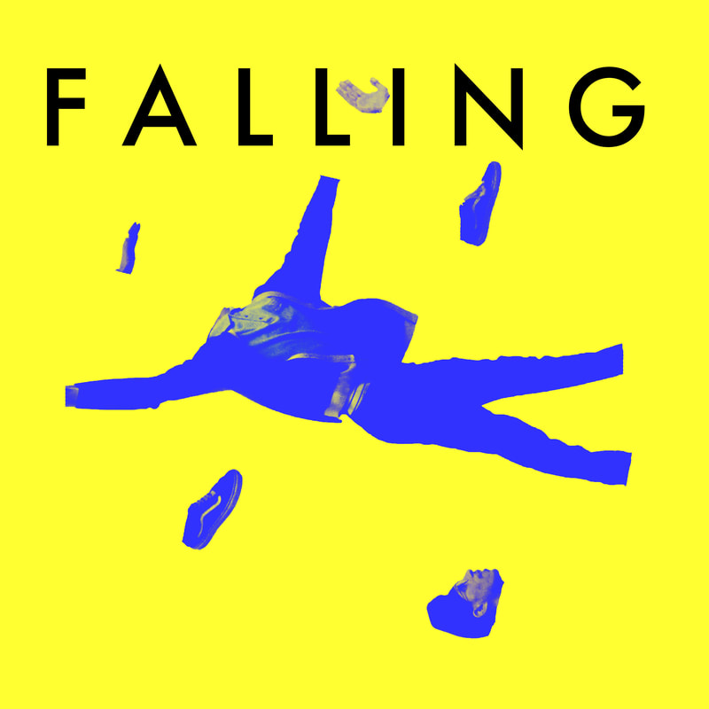
This image was largely influenced by this photo by an unknown artist that is used as an album cover for the album "SALES LP" by the band "SALES"
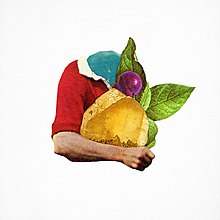
This image was easy to take inspiration from as I have been mainly focusing on photoshop and this is how this image was produced. I think that although I have inherited key themes from this photo it could have been better with more vivid and bright colours.
I was also very much inspired by the film poster designs of Saul Bass. Here are the film posters that inspired me the most, anatomy of a murder and vertigo.
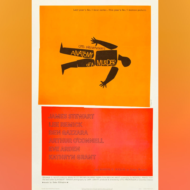
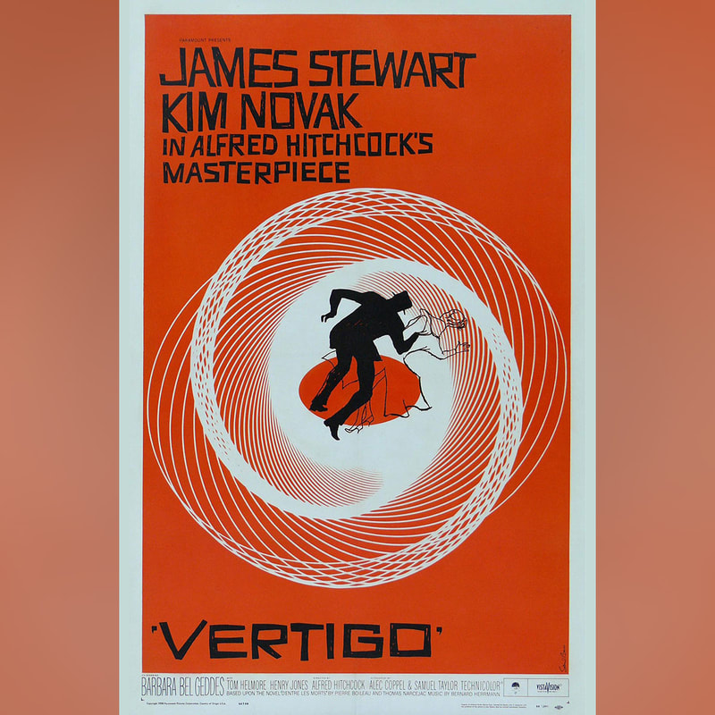
Although these aren't photographs I draw direct inspiration from them in this last photo. You can see that i have been inspired by the anatomy of a murder poster through the common theme of the split up body and you can see that I have been inspired by the vertigo poster from how the body looks as it is falling.
I decided that because I felt like it missed colour I would add some in and I am very pleased with the results
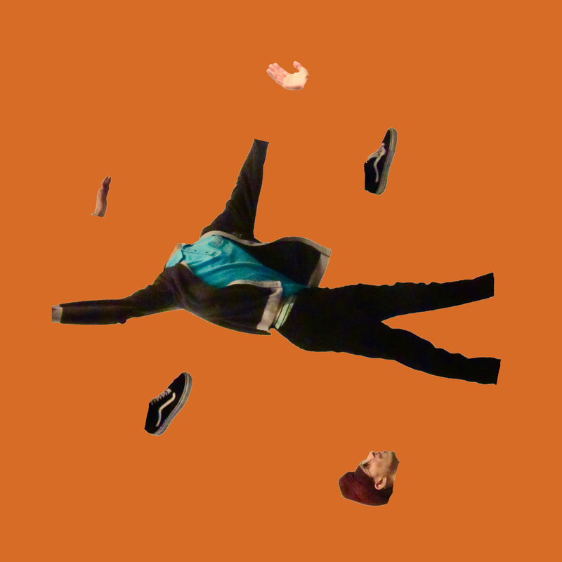
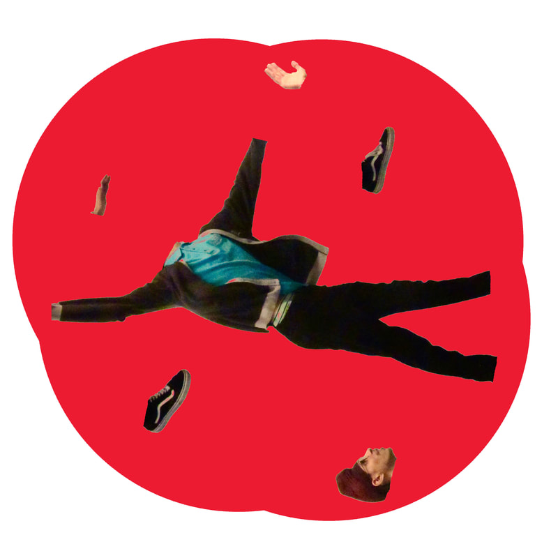
For the last two pictures I sampled colours from the "Anatomy of a murder" film poster because I like how the the colour scheme looks. But overall I like how the pictures look and I think that I have made.
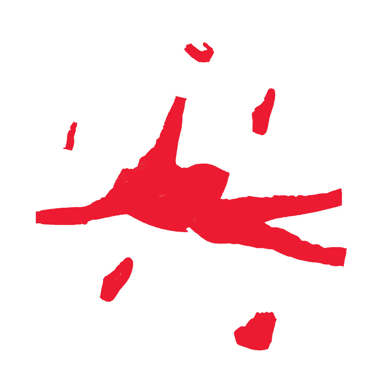
This is how I made them:
This is how I made them:
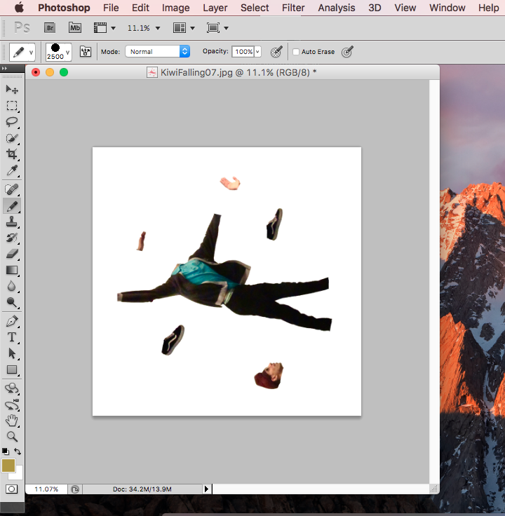
First I opened up the image in photoshop.
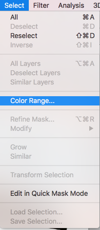
Then I selected colour range in the select part of the menu.
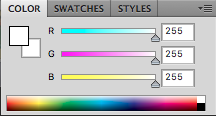
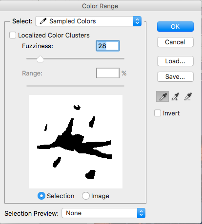
I then selected all of the white areas in the photo and used an appropriate amount of fuzziness so the selection would be smooth

I had then selected what I wanted so I could use the pencil tool and command+shift+i which inverses the selected area so I could implement the colours that I wanted.
For the ones which have the same colours as the anatomy of a murder poster I used the dropper tool so the colours were exactly the same.
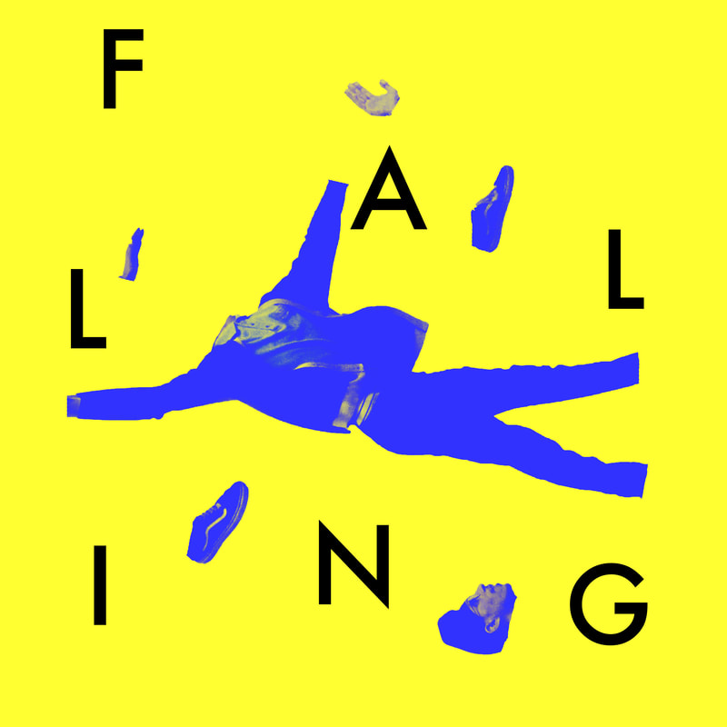
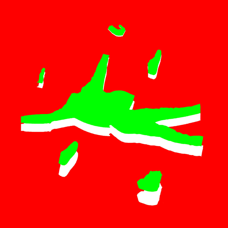
I then experimented with text and coloured in the picture in differently and I think that the results look great, I like the second one best because I think that it looks like a book cover.
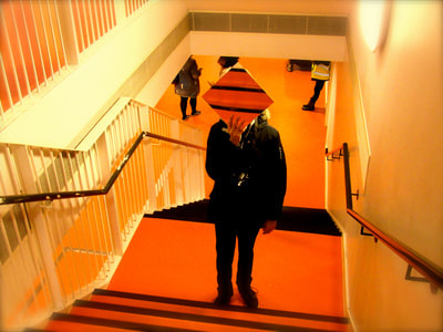
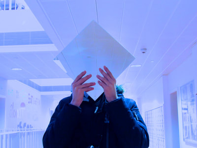
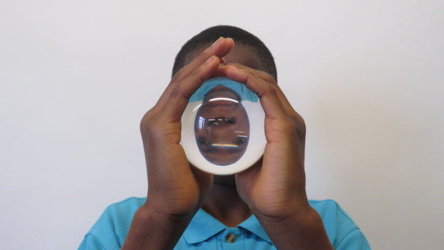
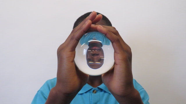
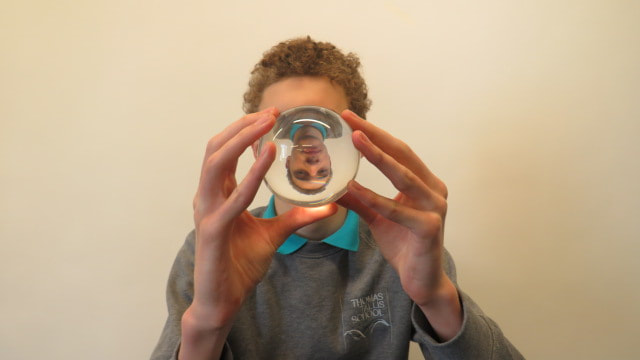
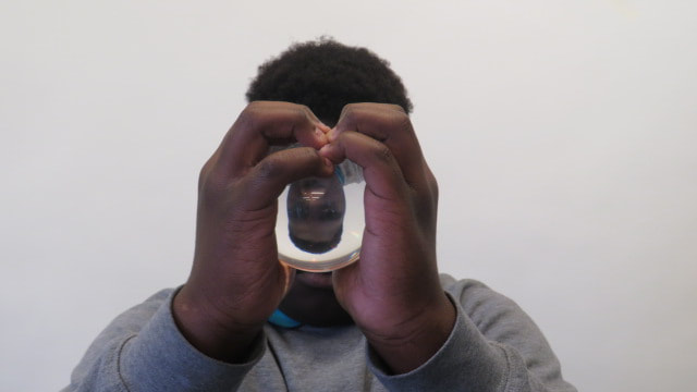
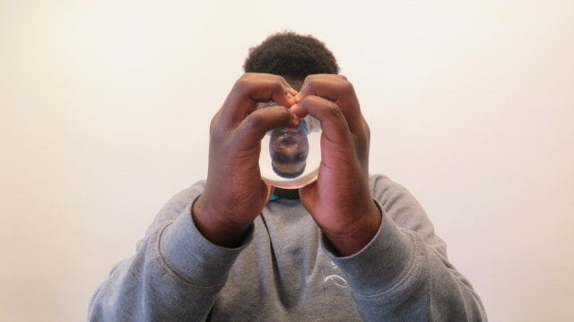
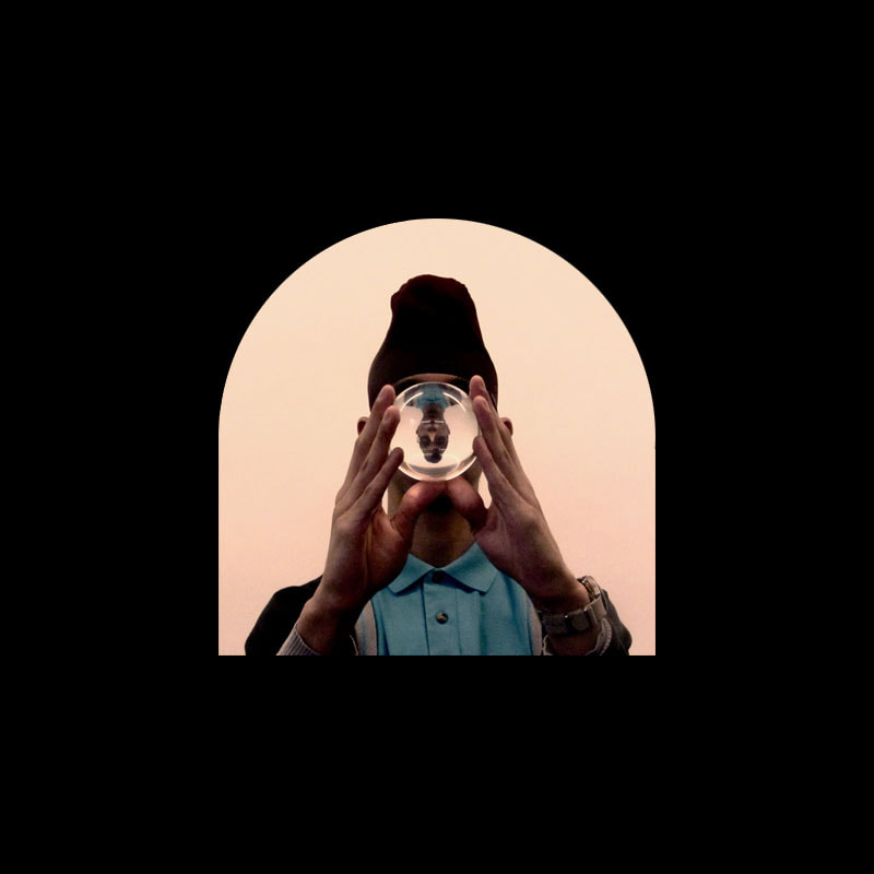
Glass Ball Portraiture
I also brought in a glass ball that day so I could take this shot, in the shot the ball flips the image of the person, I edited the photo in iPhotos and i added a red tint to the image which was inspired by the warm colours in the photograph "Soliloquy IV" by Sam Taylor-Wood and cropped it to be square which was inspired by album covers and this was the result
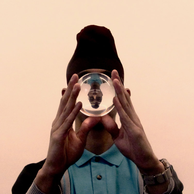
I am very happy happy with this image for a few reasons:
1.) I like the feelings that this image shows with a mix of it's red tint, it's contrast and it's grain I was attempting to achieve a similar feel to "Soliloquy IV" by Sam Taylor-Wood through the editing and I believe that I have achieved that to a certain extent
2.) The composition. I like how the image is symmetrical, symmetry is key for many artists that I love such as the film director Wes Anderson, his compositions and colour schemes are a major inspiration to my work and although before I have failed to achieve similar aesthetics now I believe that this is a good response to his work. I also like how I have also edited the image into a square 1:1 aspect ratio, Wes Anderson also uses irregular aspect ratios but I believe that I was most influenced by album covers. Here are some album covers that I love:
3.) The glass ball. I really like the how the glass ball came out in this photo and how it projects his face upside down onto it is exactly what I wanted to happen. The light reflecting off the ball also looks very nice.
I am definitely going to try and make this into a set of photographs
I am definitely going to try and make this into a set of photographs
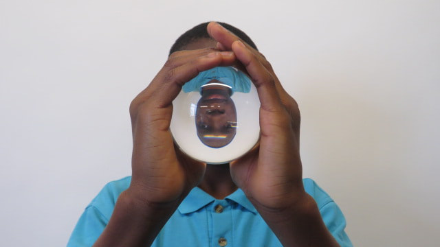
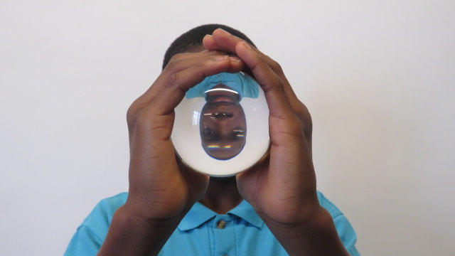
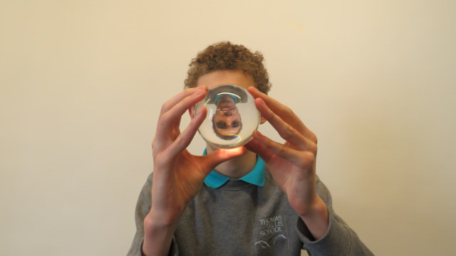
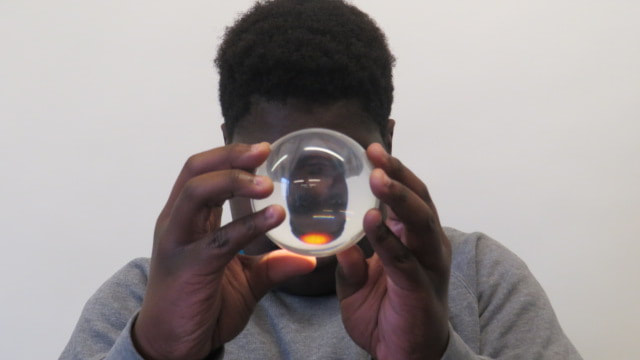
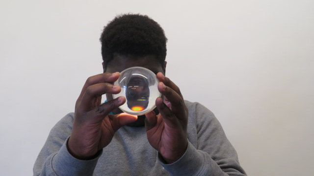
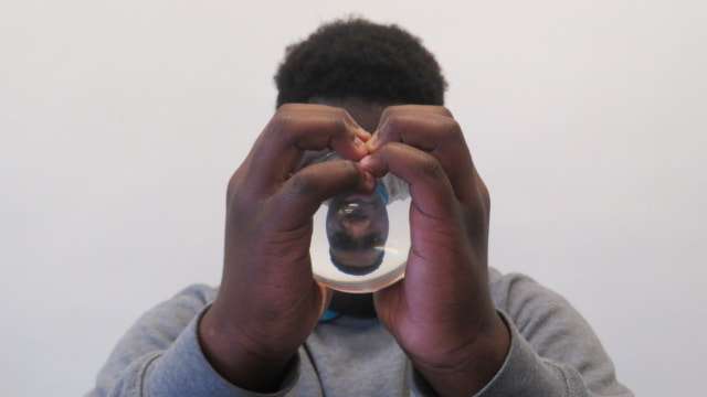
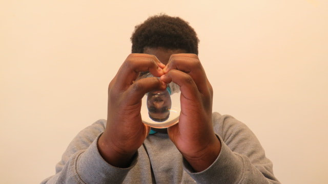
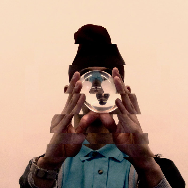
Here are some extra attempts before selection and editing, I don't think that any of these photos have the same feel of the first one, I think that this is partly because of how Harkeerat holds the ball which is a lot more aesthetically pleasing than how Jide or Brandon or Josh do. I also think that it is partly because these images are far less symmetrical than the other one was, I am going to retake these images with this in mind so that I can improve on them.
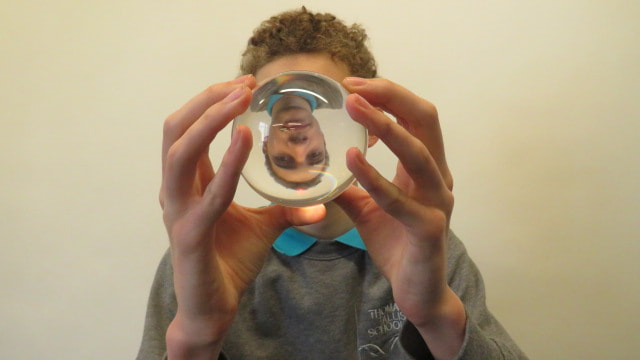
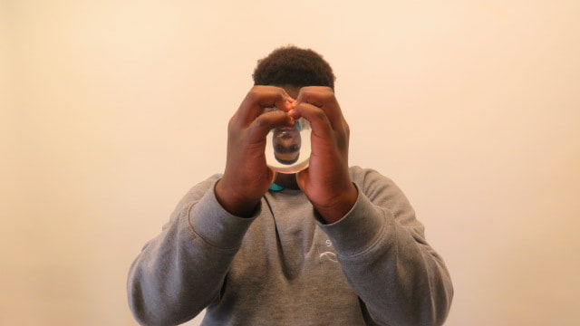
Here is a photoshop edit I made of the photo, I like how it came out although I do prefer the original
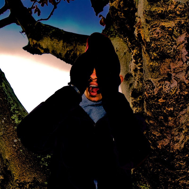
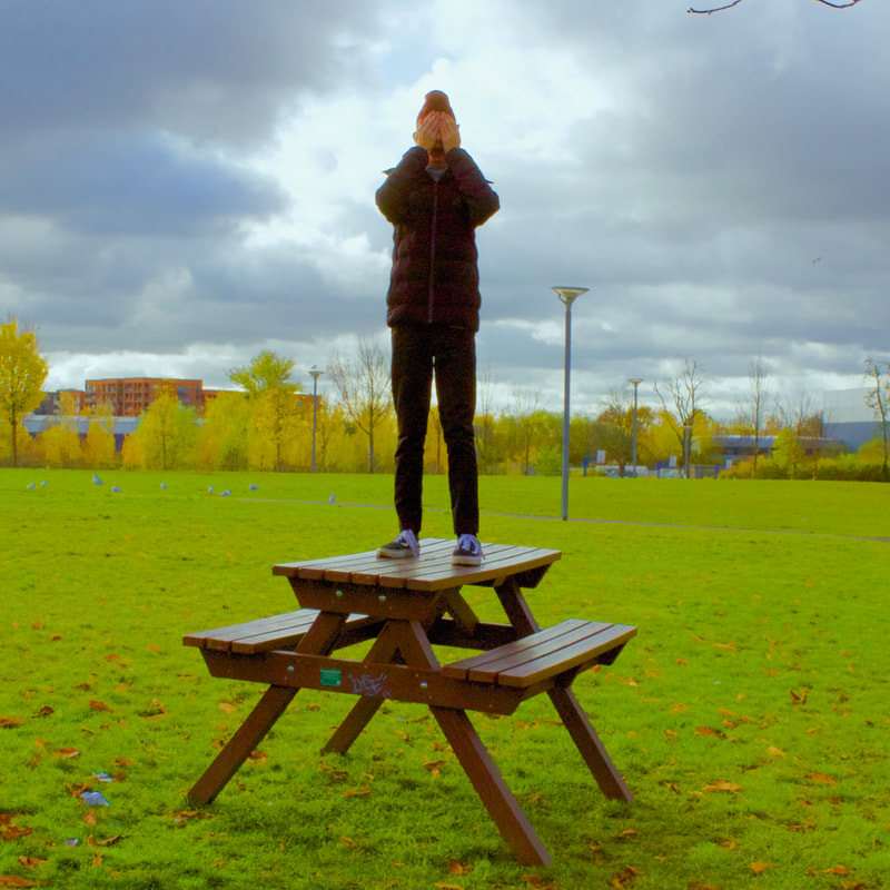
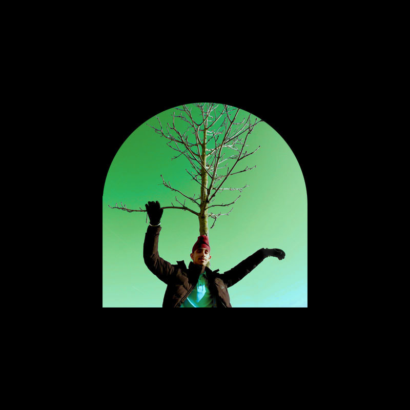
I wanted to do some pictures outside to extend my range in backgrounds, my main focus was on making my photos as unusual as possible, so I got Harkeerat to climb a tree and stand on a bench, I then highly edited them in iPhoto to make them look surreal. I especially like the one with him in the tree because of how the colours and tones came out, you can see this in both the sky and the tree respectively.
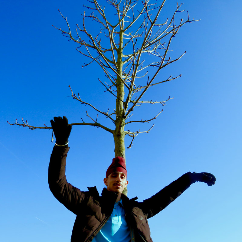
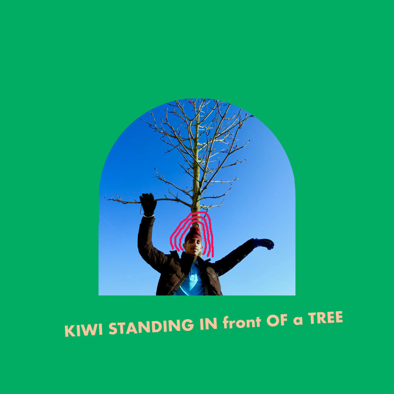
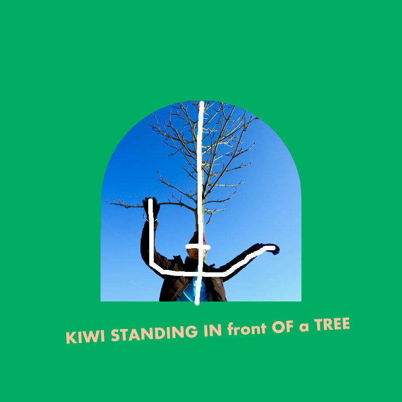
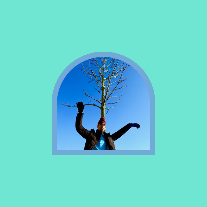
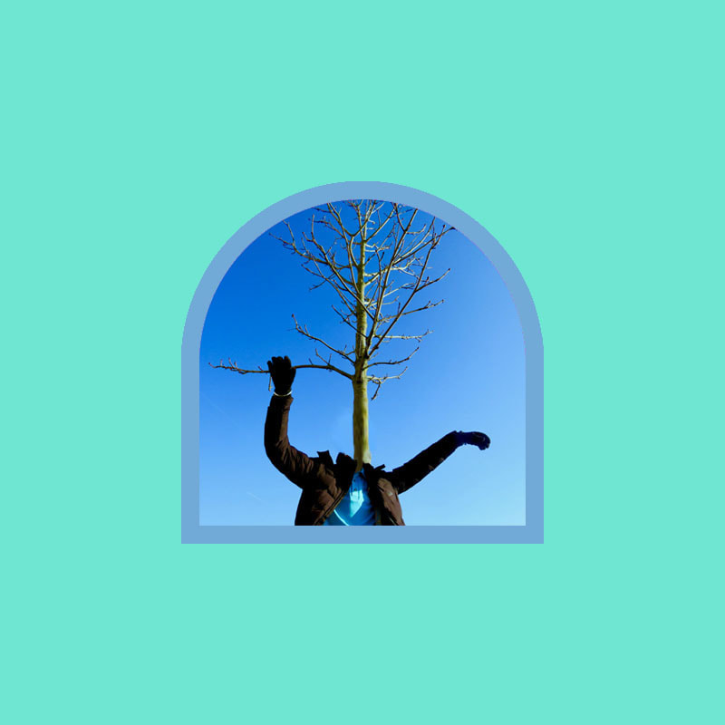
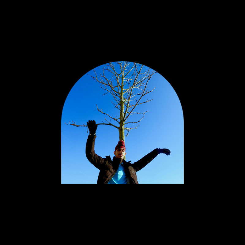
I decided to take more photos outside with trees. I got a friend to put his head directly in line with the tree because we were told that it's something that we shouldn't do but I think it looks really good in this instance. I think that it works within the context of this photo because the background is simple and because it's obvious that I intentionally chose to do this
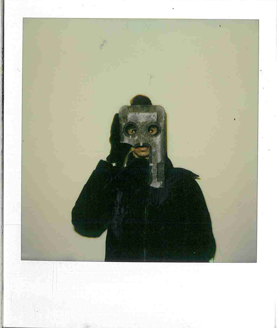
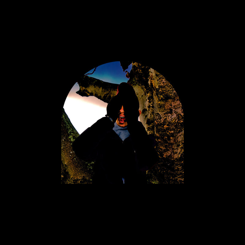
I wanted to further increase my range and I realised that all of my pictures were with a digital camera so I decided to take a photo of Harkeerat with a polaroid camera because it is analogue. I then scanned them with the printer. I think that the photo came out very well and I think that it has the look that I was looking for. I'd say that the block that he is holding in front of his face looks cool because you can't tell what it is but it looks like a mask.
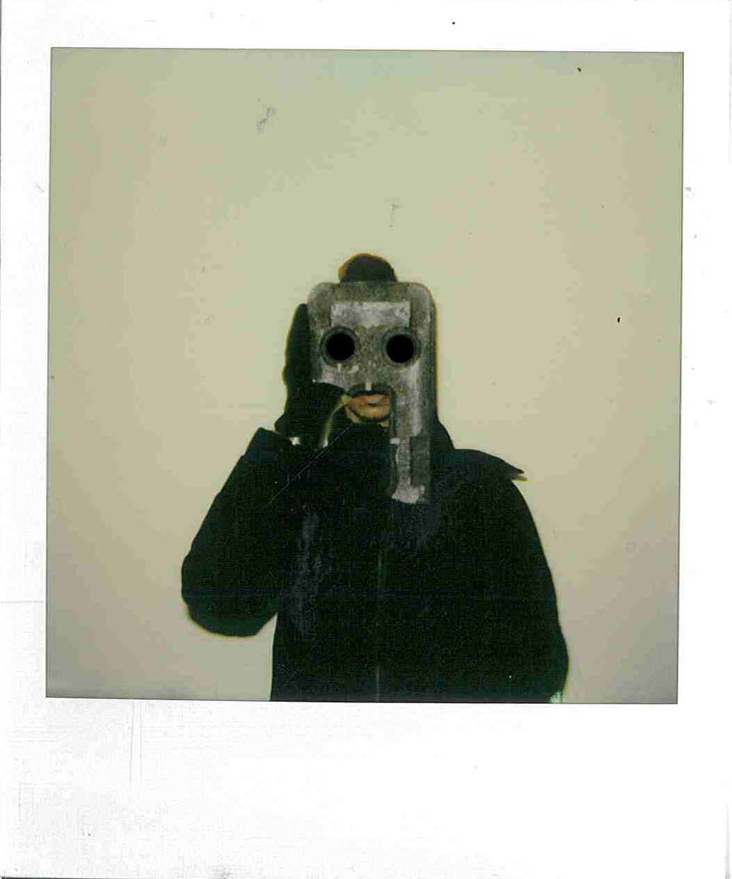

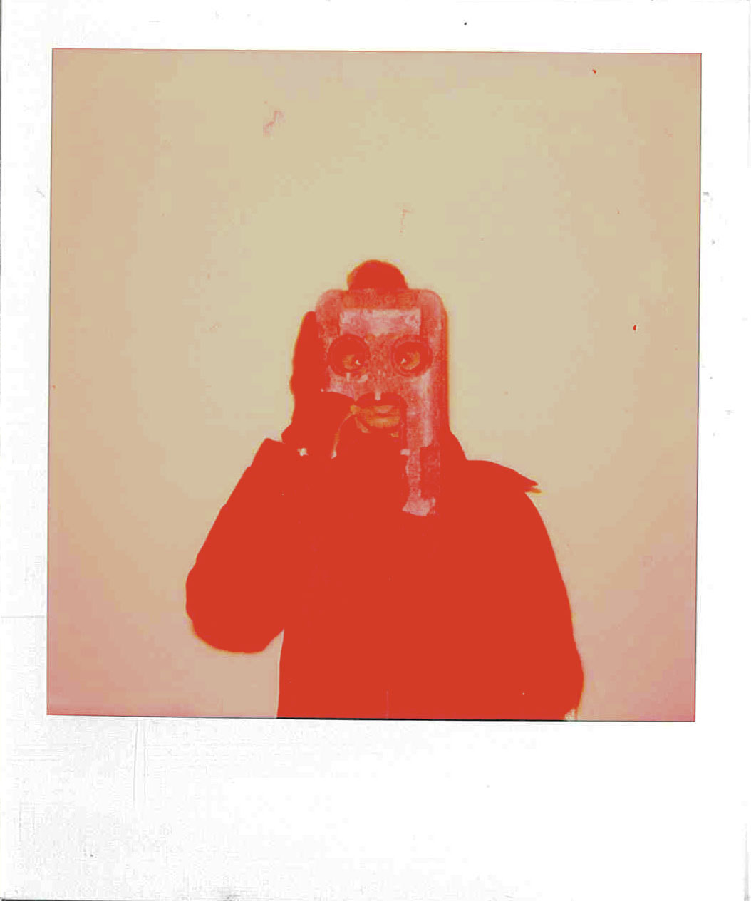

I decided to edit the photos because although I know that it makes the photos no longer completely analogue I knew that I could make the photos more unusual and I think that it was an overall success. I think that these photos all look quite haunted and I think the ones where I fill in some of the spaces with black definitely emphasise this and I would say that they don't even look edited.
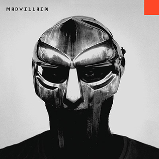
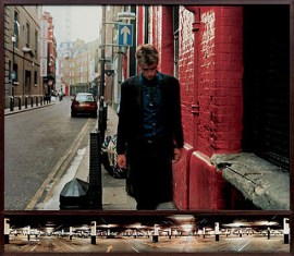
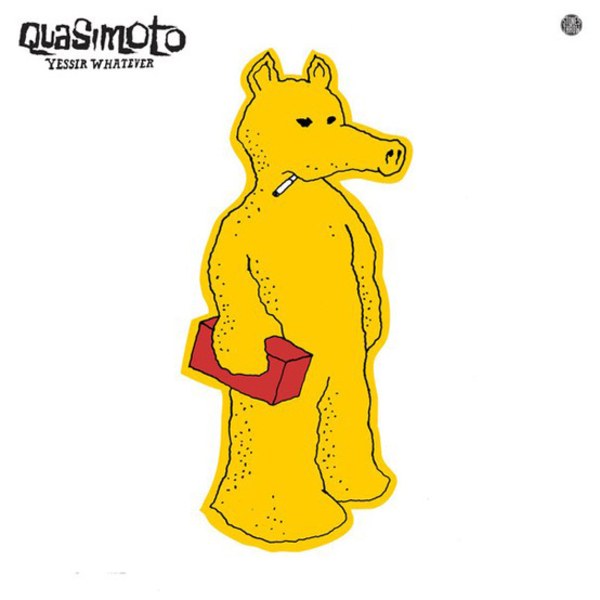
I was inspired by this album cover to the album "madvillainy" by madvillain. The photo was by Jeff Jank, the art director for the record company. I took inspiration from the composition, lighting and editing of this image
Final Piece ideas and attempts.
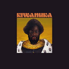
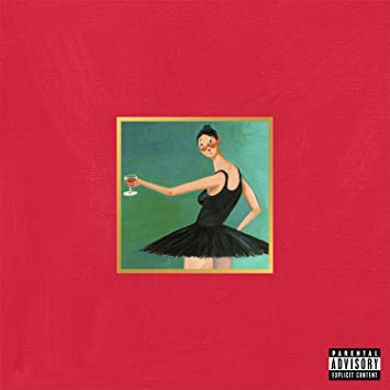
Here are some attempts at my final pieces, I'm not sure if theyre what I wanted to do but I think that it's pretty good for what I need to make in the time period that I have been given. I think that these experimentations give me a lot of range of what I can do with photoshop including what I can do with the colours and shapes and it also makes it easy for me to experiment with text which I haven't really used before. I also can't really say that I have been influenced by anyone for this piece besides from the 5 album covers of "my beautiful dark twisted fantasy" by Kanye west which were designed by artist George Condo and also the album cover for "Kiwinuka" by Michael Kiwinauka
I was influenced by the image being small and in the middle of the frame
The Final Final Pieces
These are my completely finished and chosen finished pieces.
